UX design for restaurant website
from concept and user research to final designs
ROLE: UX-researcher/designer, 2023
RESPONSIBILITIES: concept and user research, wireframing, usability study, prototyping, mockups
PROJECT VISION
GRANÒ's goal is to open the first gluten-free restaurant in Zurich and, in particular, to offer people with Celiac disease - trustworthy, high-quality and tasty alternative for their daily lunch and dinner. One target group is people working in the city.
Therefore, the vision for this website was to (1) inform about GRANÒ restaurant and where - when - what to find, (2) provide useful information to highlight the safety measures taking place for people with Celiac disease and (3) provide ordering options for an every day website experience with their weekly changing dishes and no-waste hour events.
CHALLENGES
One of the challenges was that GRANÒ does not yet have a restaurant and is in its first stages of development. This is a great opportunity, but of course also associated with uncertainty, such as what the future restaurant will look like.
Since GRANÒ is not a standard restaurant, but serves dishes for very specific food illnesses that require a very high organisational level of food preparation and safety measures, it was important to first develop an understanding about these food diseases. As it is very important for this user group to easily retrieve all important information, more emphasis was placed on the relevant details.
Another challenge was to use an already existing Corporate Design and additionally make changes to my designs to adapt them to new ideas that came up with new GRANÒ projects.

RESEARCH
I conducted a competitive analysis that included gluten-free restaurants and restaurants in the city center of Zurich, had an intensive exchange with the founder of GRANÒ to better understand the needs of people with Celiac disease, and read a lot about UX design specifically for restaurant websites.
IDEATION
- What is GRANÒ?
- What food do they offer?
- What events happen at GRANÒ?
- What can I find at their shop?
- How can I imagine the restaurant to look like?
- How to get there? About and Contact.
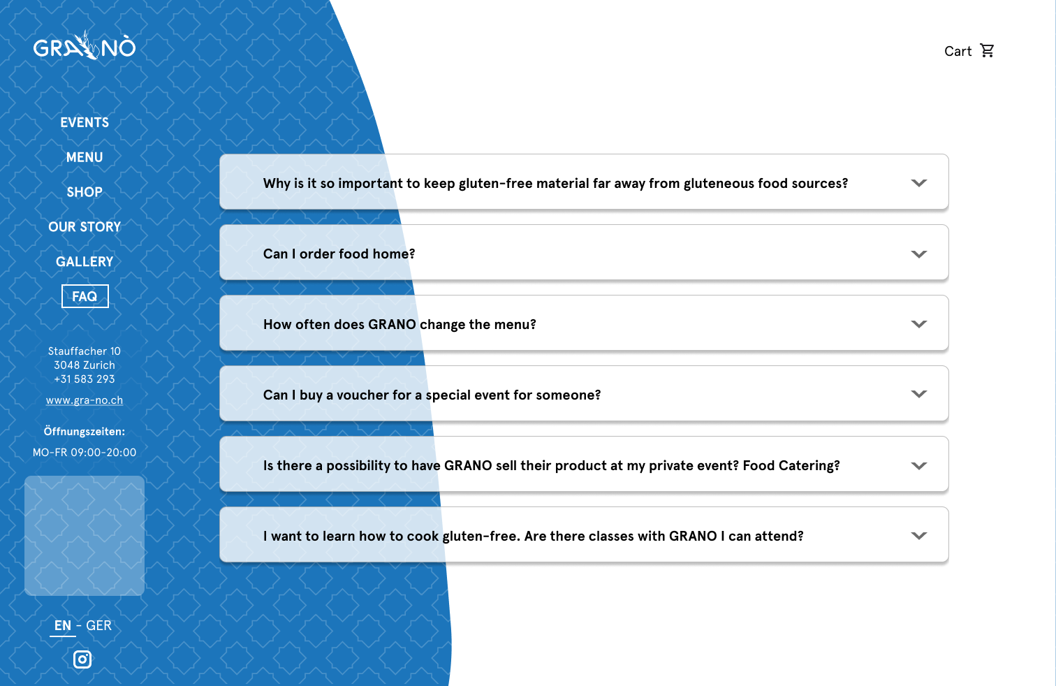
- Frequently asked questions?
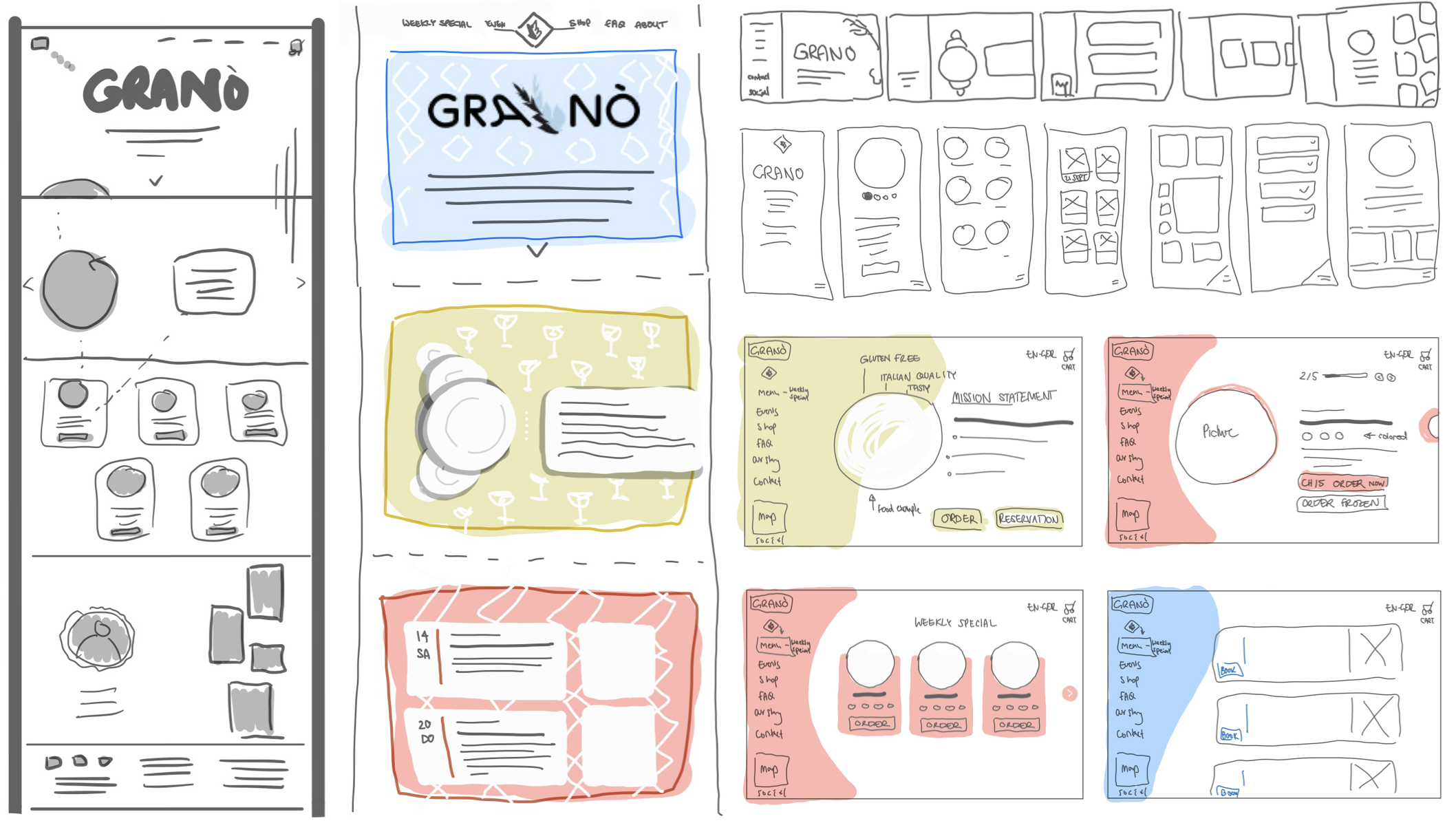
SEQUENTIAL SITEMAP


To get a first feedback on the organization and navigation of the website, 3 participants were asked to provide feedback for low-fidelity wireframes. This information was mainly used to improved the navigation and concept page (homepage) of the website.
● ● ●
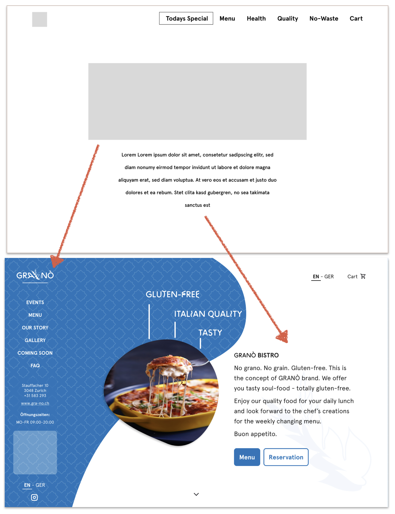
GRANÒ - Homepage.
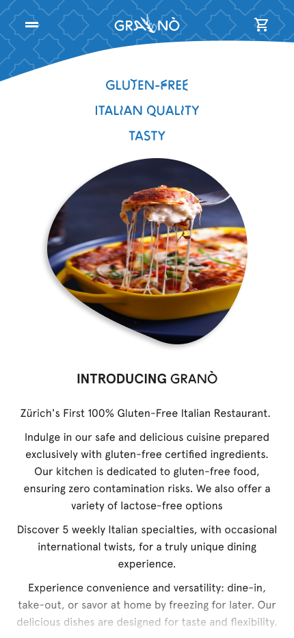
It quickly turned out that the homepage should not only consist of the logo with explanation/concept idea of GRANÒ, but should already provide more insights of what GRANÒ offers.
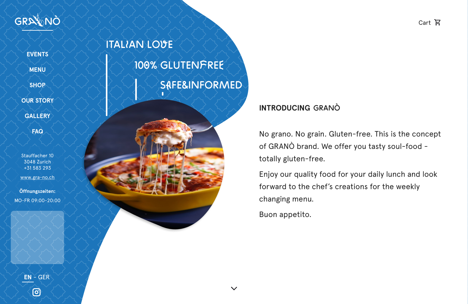
Therefore, an animation of the logo functions as a splash screen with an automatic transition to the homepage, which informs about GRANÒ with an image of one of the dishes offered, three highlights, concept idea and menu-bar.
● ● ●
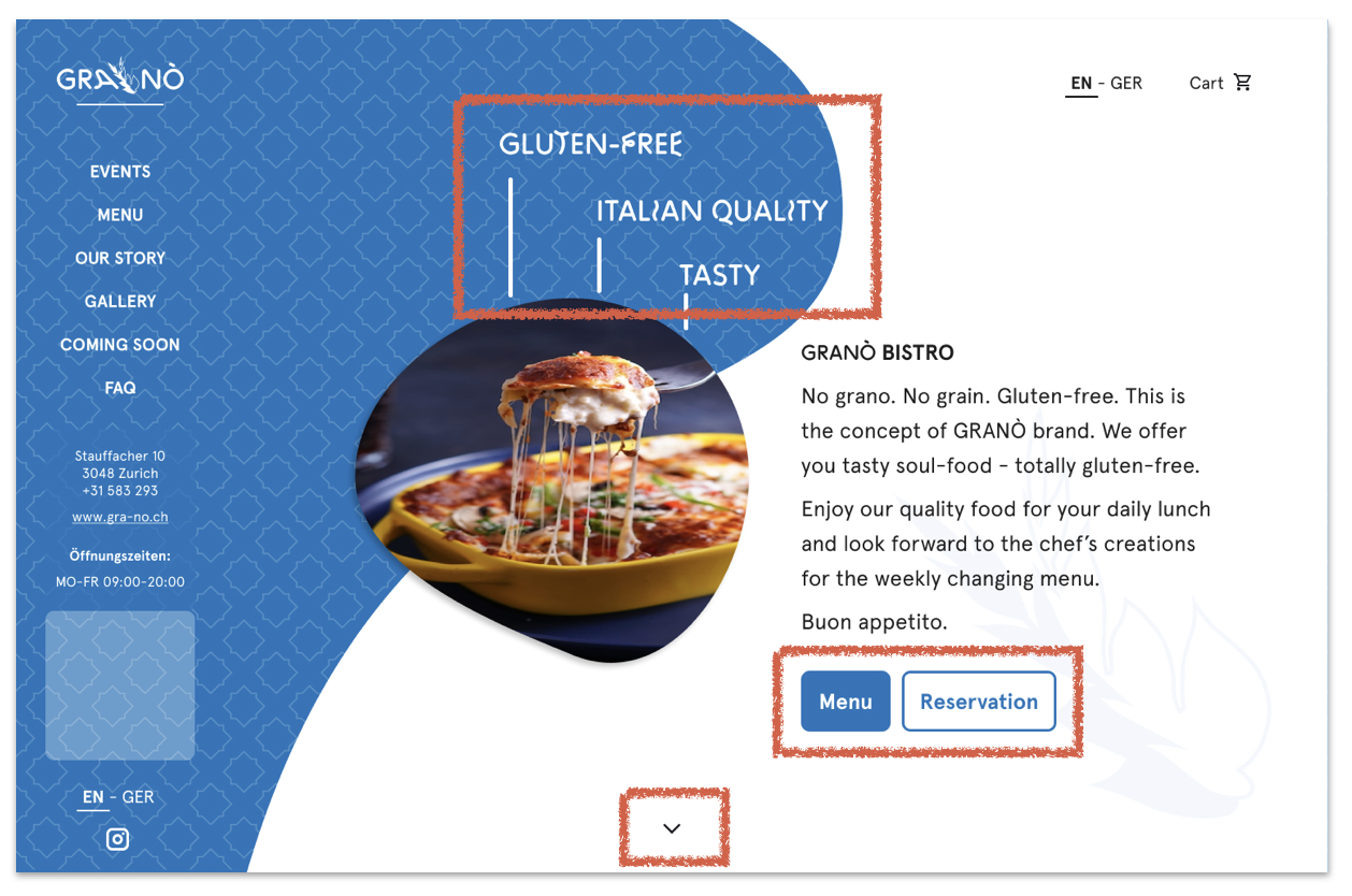
The image appears centered and is rounded-playfully shaped so that both landscape and portrait images fit well.
3 take-home-messages let GRANÒ's highlights stand out. The explanatory text is devided into title and text to enable users to easily grasp the idea of GRANÒ in a few words. Two buttons provide a direct link to the most common options “Menu” and “Reservation”.
As it may not be intuitive for users to know they can slide further downward, a downwards pointing and bouncing arrow indicates the further options.
● ● ●
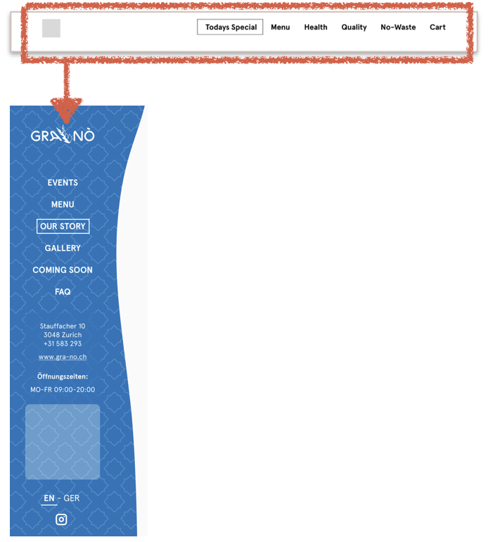
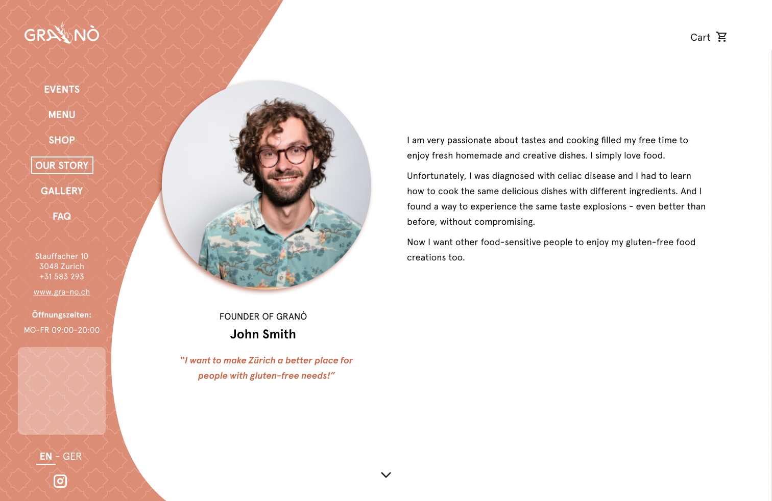
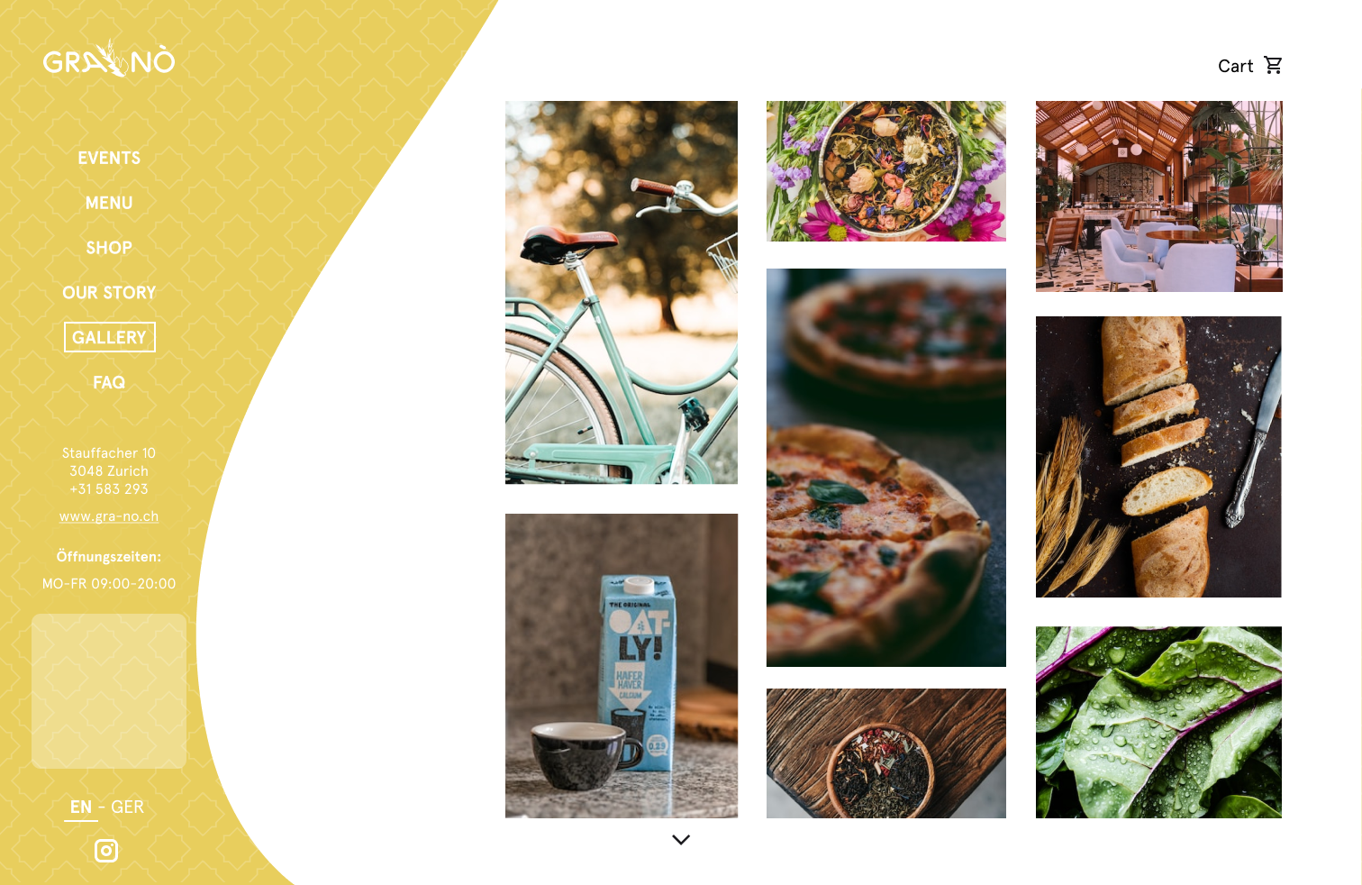
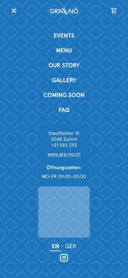
The menu was rearranged several times. Initially, the menu was placed top right, but as the website is a one-pager, with pages changing as you scroll down, the menu was finally placed on the left hand side for a more intuitive flow.
A box moves from top to bottom and changes shape - in a playful way - to adapt its width to each menu-item.
Since a one-pager typically does not offer a footer on each page, but only on the last page, the footer content was also integrated within the left bar. It contains important informations such as address and map (see placeholder), opening hours, social media and also the languages switch (EN - GER; English - German).
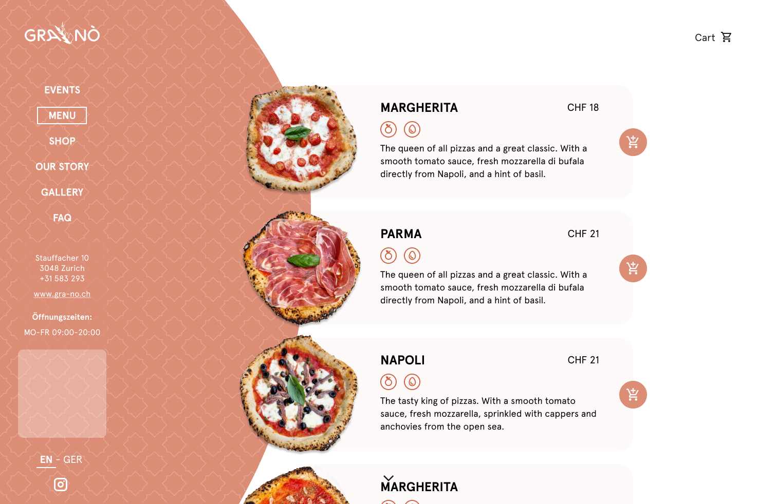
Since GRANÒ was simultaneously developing its overall concept, some of its ideas changed in the course of the project: GRANÒ will advertise itself with a mobile pizza bike. Therefore, instead of the previous idea of presenting each dish with an exciting story, the menu will give a quick overview of the available pizza variations. In addition, the prementioned pizza bike events are now highlighted in the event section.
● ● ●
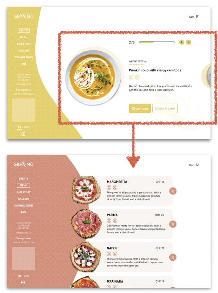
GRANÒ will offer 5 different dishes that change on a weekly basis. The first design attempt highlights each dish to be able to share some more food-insights. The plate would move in a 45 degree rotation with the text following thereafter. The user could click left and right to move through the 5 dishes.
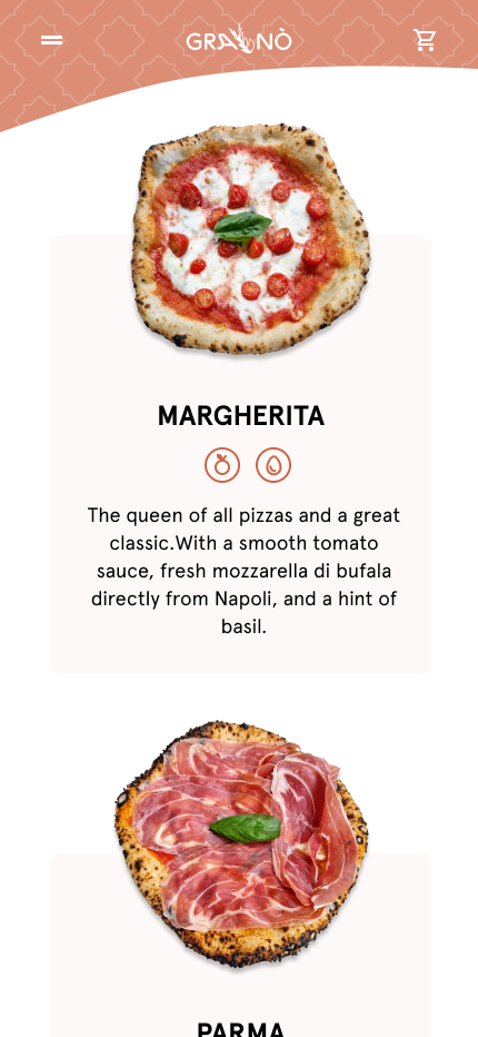
Finally, showing all dishes at once was considered to provide a better overview. Food cards present each dish with a small description.
Ordering:
GRANÒ will offer users to (1) eat on site, (2) take home warm, (3) take home frozen. Previously, the order option could be selected directly by choosing one of two buttons ("Order now", "Order frozen"), whereas its meaning was not clear to the users. Being able to select different options for different dishes would also lead to chaos in the ordering process (i.e. mixed takeaway warm and frozen orders).
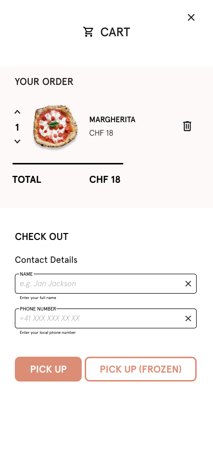
Now, the user can add a dish to the shopping cart and later select one of the meal options "PICK UP" and "PICK UP (FROZEN)". Users that want to eat on site are considered to call to reserve a table first (same as for other restaurants).
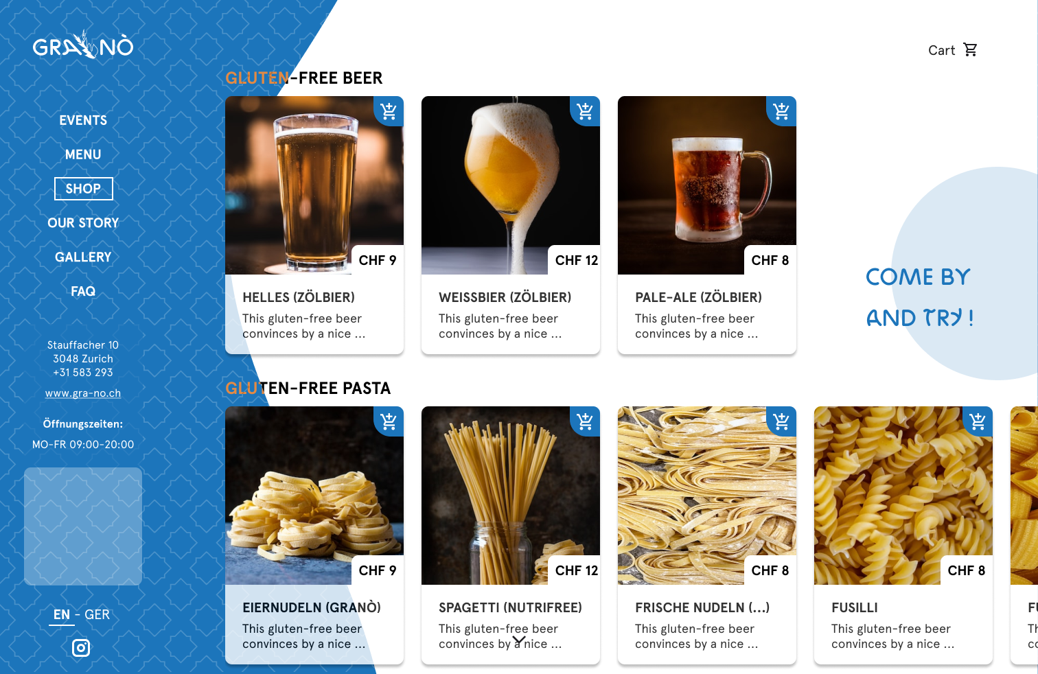
It is worth mentioning that the future shop will also offer events and shop items to be added to the checkout.
● ● ●
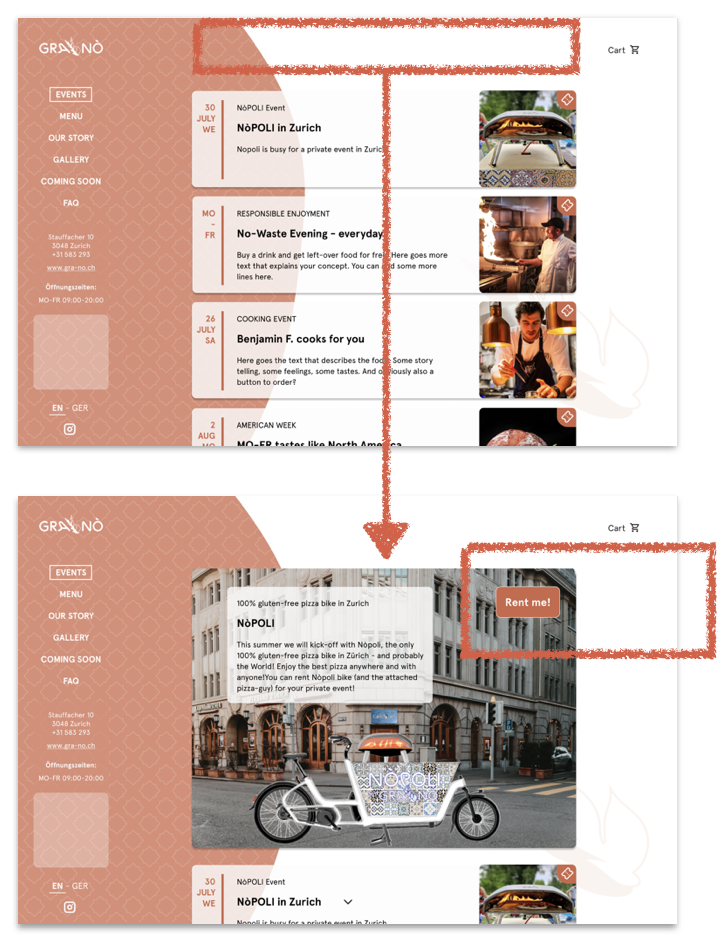
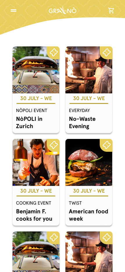
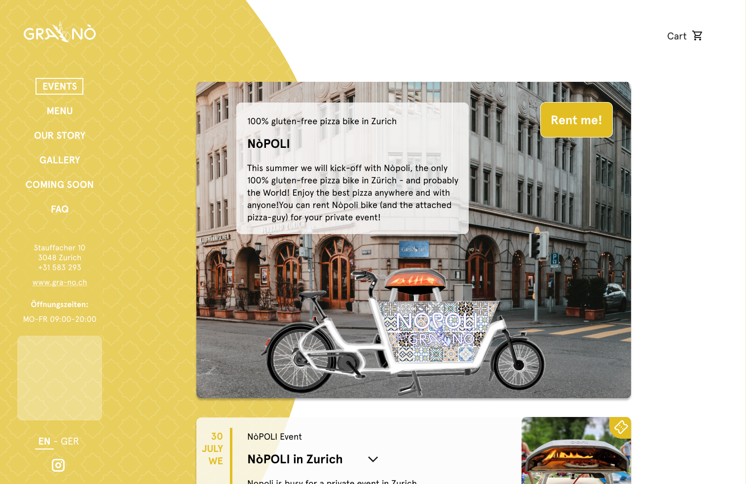
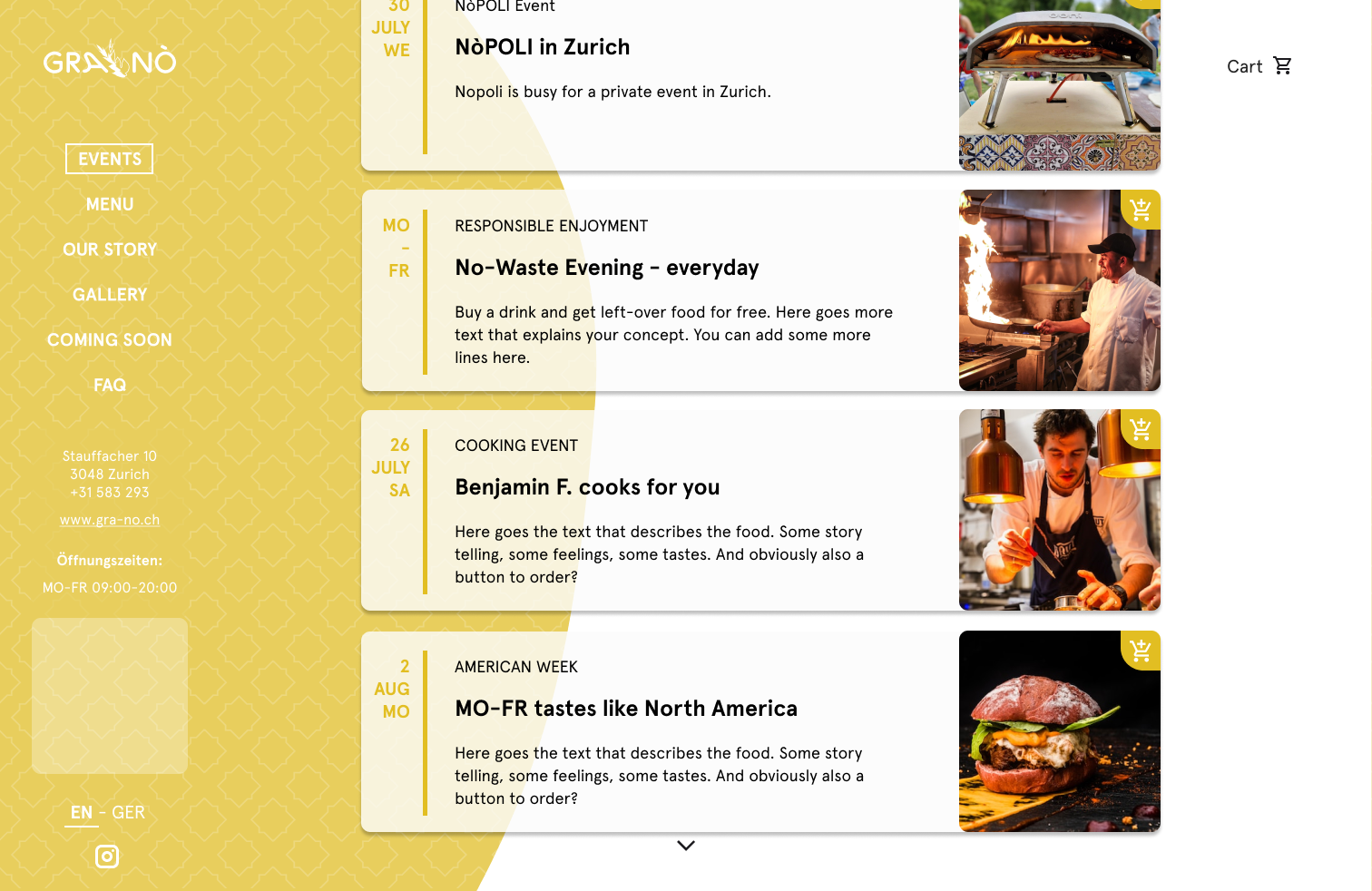
First, the events were displayed as cards, organized by date. Each card contains the date and the corresponding day of the week for better orientation, as well as a category, a title, a text and an image to provide some insights. Additionally, a ticket button has been integrated. By clicking on the ticket button, the ticket is added to the cart. An overlay window can be implemented here to have the user confirmed adding the item to the cart.
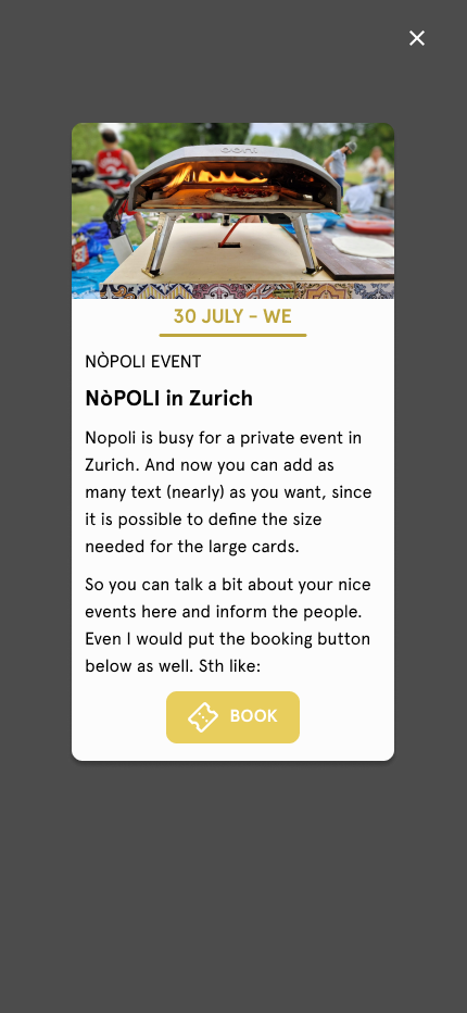
To have special events stand out, a large first card has been implemented. In this example, it shows the food-bike “NÒPOLI”, which can be rented (“Rent me”) so that the chef can prepare his gluten-free dishes at your event.
● ● ●
Details about the ordering process and the future shop have been thought through and are presented below.
● ● ●
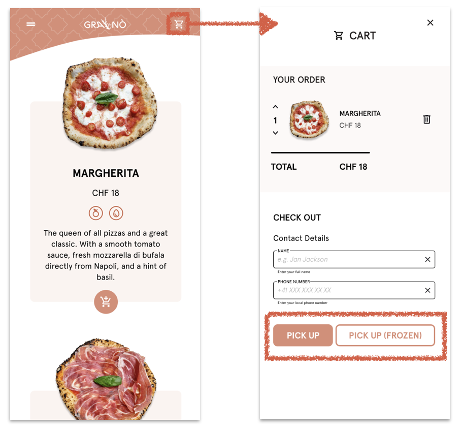
ORDERING workflow.
Clicking the “add to cart" button will cause the button to move. Adding an item to the cart will trigger the cart icon in the top right corner to be highlighted by a small pink dot indicating that something has been dropped in (review video for more details).
Clicking on the cart icon displays the cart content as well as the options “PICK UP” and "PICK UP (FROZEN)" (in future "DELIVERY" might be added). The cart content “YOUR ORDER” can still be adjusted (change quantity, delete item from cart).
● ● ●
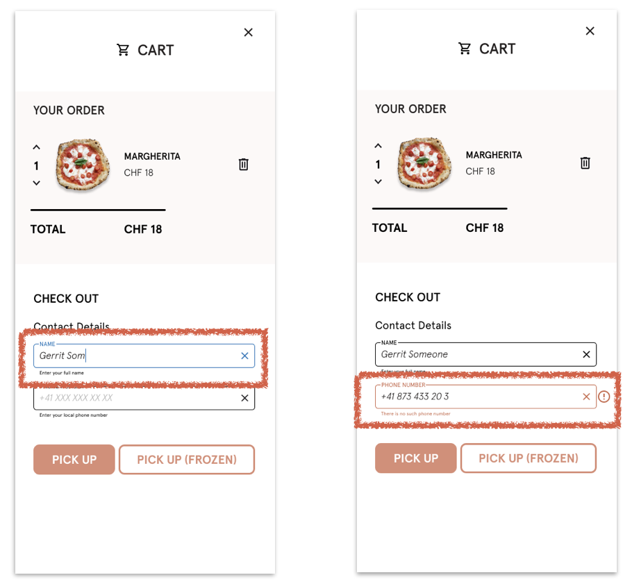
During the checkout process, the user is asked to provide some contact information.
A cursor indicates the user's current position in the field and prevents users from unnecessary operations.
The color of the input field provides information about its use. A blue outline highlights active input fields, a red outline indicates input fields with incorrect content. The red color results from inline validation.
A trailing symbol notifies the user about invalid input.
If the user enters incorrect information, an error message is displayed underneath the input field (instead of the previously displayed helper text) and is visible until the error is fixed.
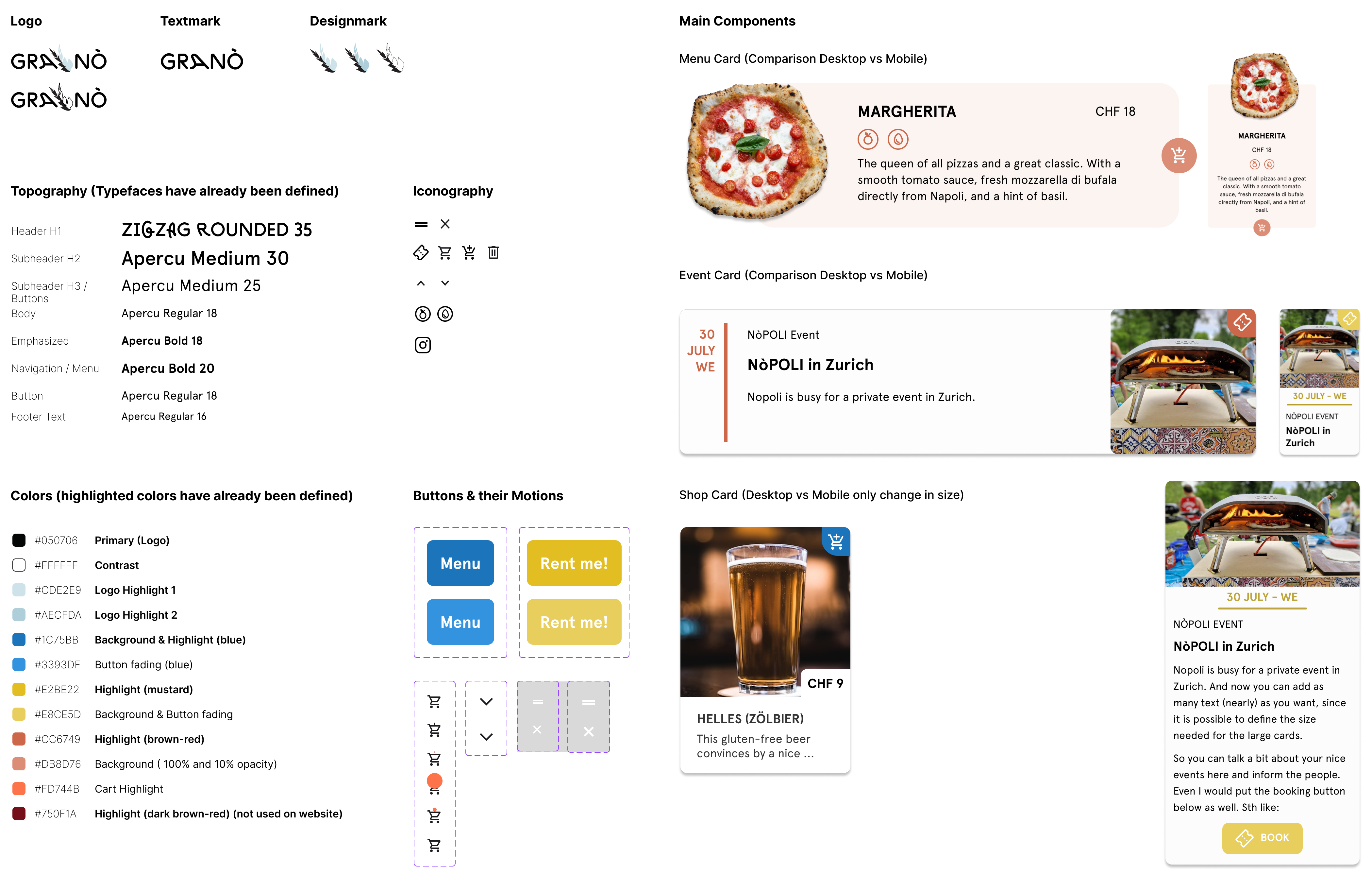
DESIGN KIT
PROTOTYPE
REFLECTION
