Innovative UX design idea for a natural disaster alarm app
for smart watch and mobile
ROLE: UX-researcher/writer/designer - part of Google UX Design Certificate Course, 2021
RESPONSIBILITIES: concept and user research, wireframing, prototyping, usability study, mockups
PROJECT VISION
This project is part of Google's certificate program and is intended to provide cross-platform experiences for social benefit. Immediately, an early warning app for natural disasters came to mind. This was especially important to me because part of my family lives in a country that is heavily affected by natural disasters such as earthquakes and ash fall from volcanoes. Therefore, my goal was:
To offer a cell phone and smartwatch app that provides timely warnings of hazards and allows users to call for help.
Although the use of smartwatches is not yet widespread in developing countries that are often affected by natural disasters, even a single person wearing a smartwatch could save several people by quickly and accurately transmitting their location.
CHALLENGES
The biggest challenge was to boil the idea down to a smartwatch format. I wanted all the important features to be available in the smartwatch version, but as intuitive, clear and appealing as possible.
Also, natural disasters are associated with anxiety and fear, which I tried to avoid through the UI design. Animations should make the touch and feel less of a "disaster". The color scheme used is meant to emphasize meaning but not convey fear.
Interaction with the app should be as pleasant and beautiful as possible.
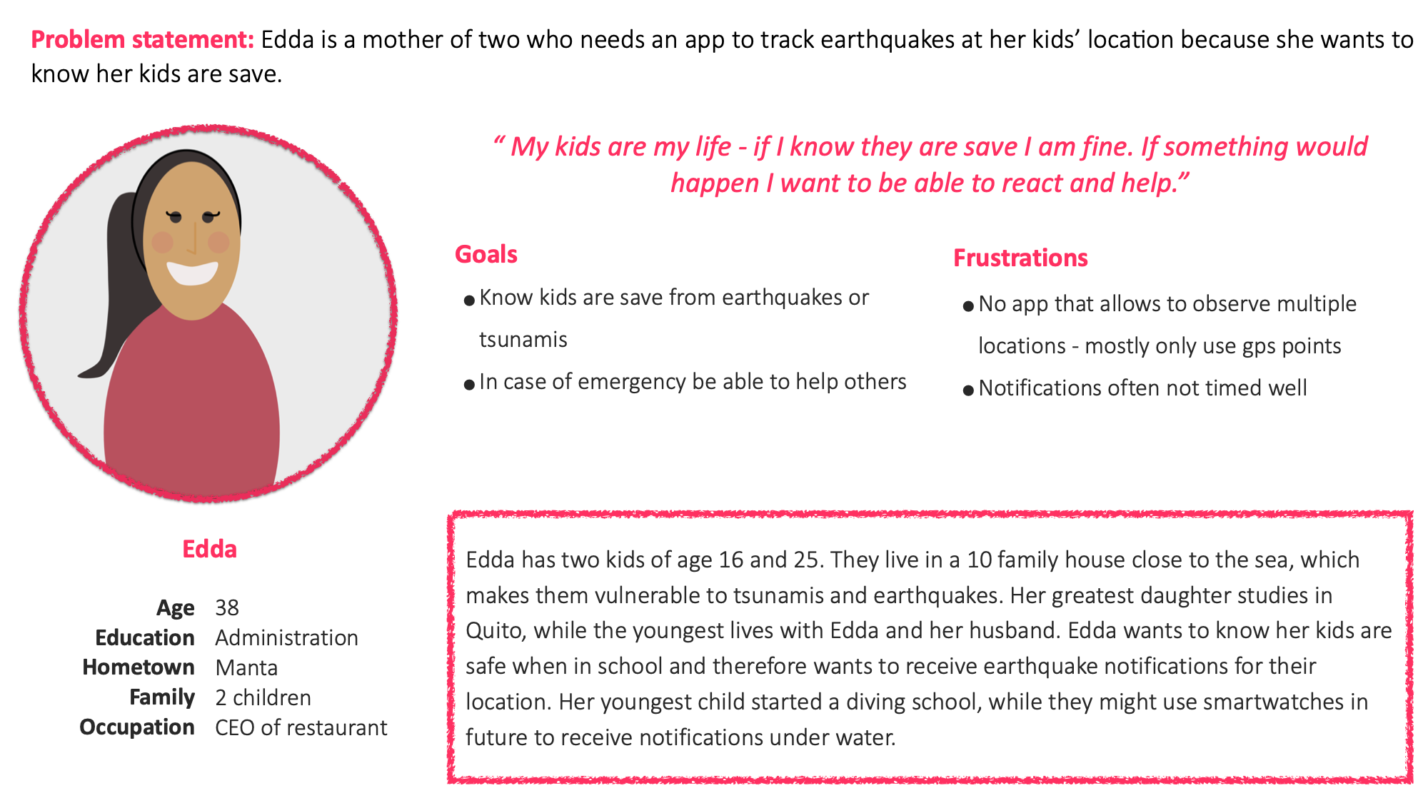
Also, the app is supposed to update the disaster status of various places so that people can track the well-being of their beloved ones.
IMPACT: In fact, there is a very interesting research about the use of smartwatches for tracking disasters and rescuing people: “Integration of smart watch and Geographic Information System (GIS) to identify post-earthquake critical rescue area part. I. Development of the system” . The use of the smartwatch as an early warning system is a big topic and will receive more and more attention in the future - when more people use smartwatches.

RESEARCH
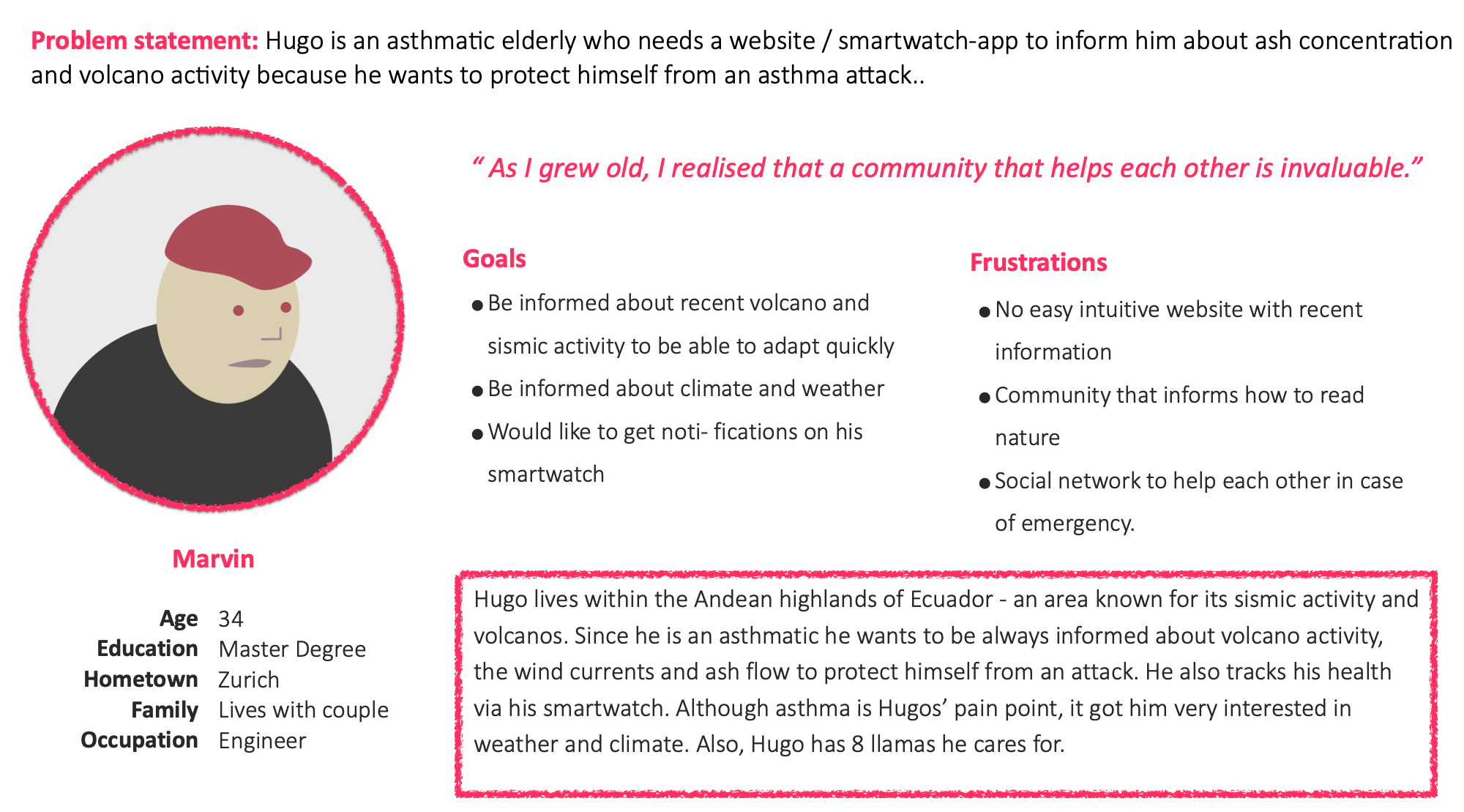
I interviewed my family and relatives and additionally researched on the internet. It was very interesting to listen to people who have a lot of experience in dealing with natural disasters and how they usually find out about them. Also, there are already some apps on the market and it was interesting to study them as well and improve on their results and ratings.
"I would like to know about earthquakes at different locations since my family lives somewhere else.”
IDEATION
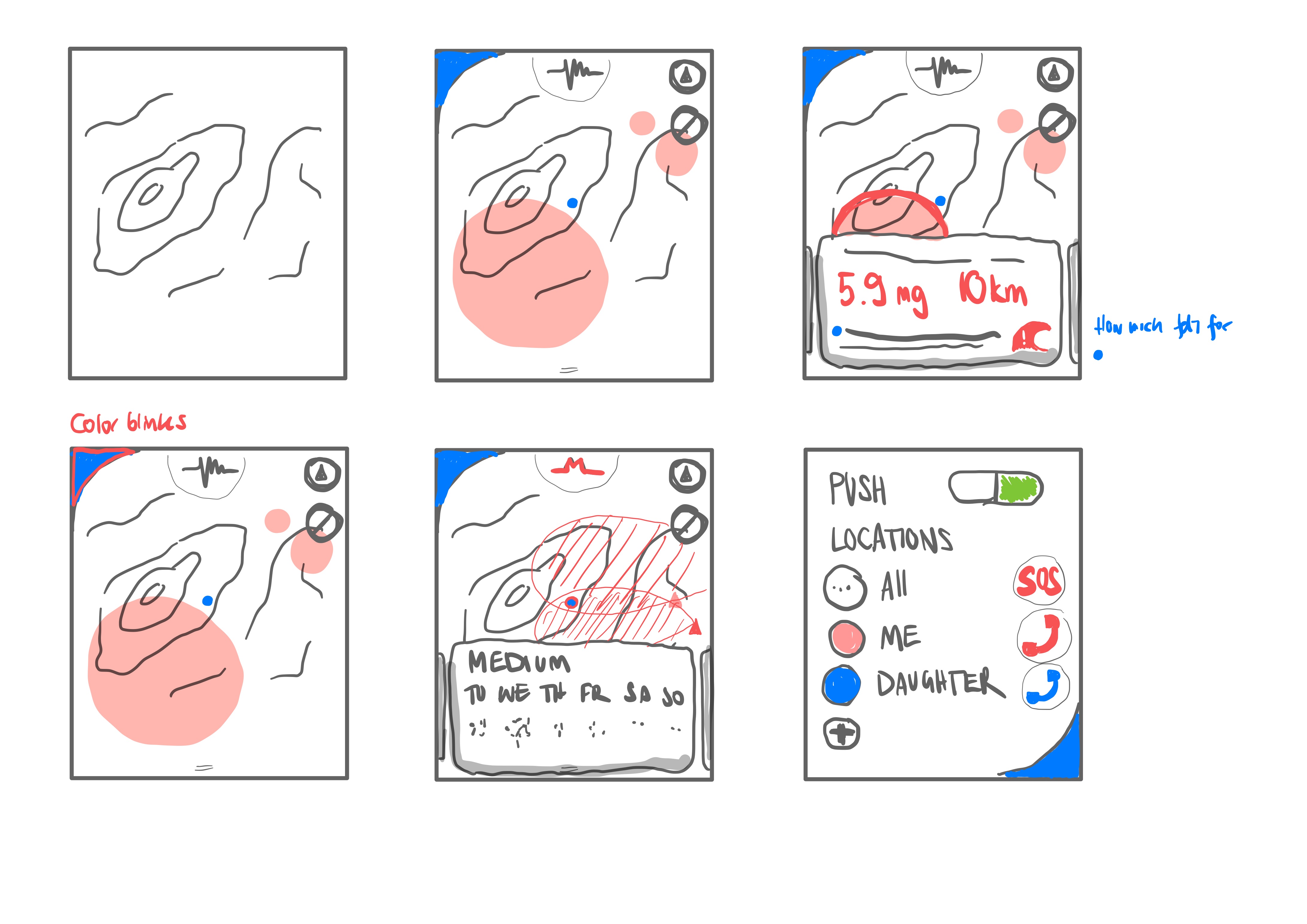
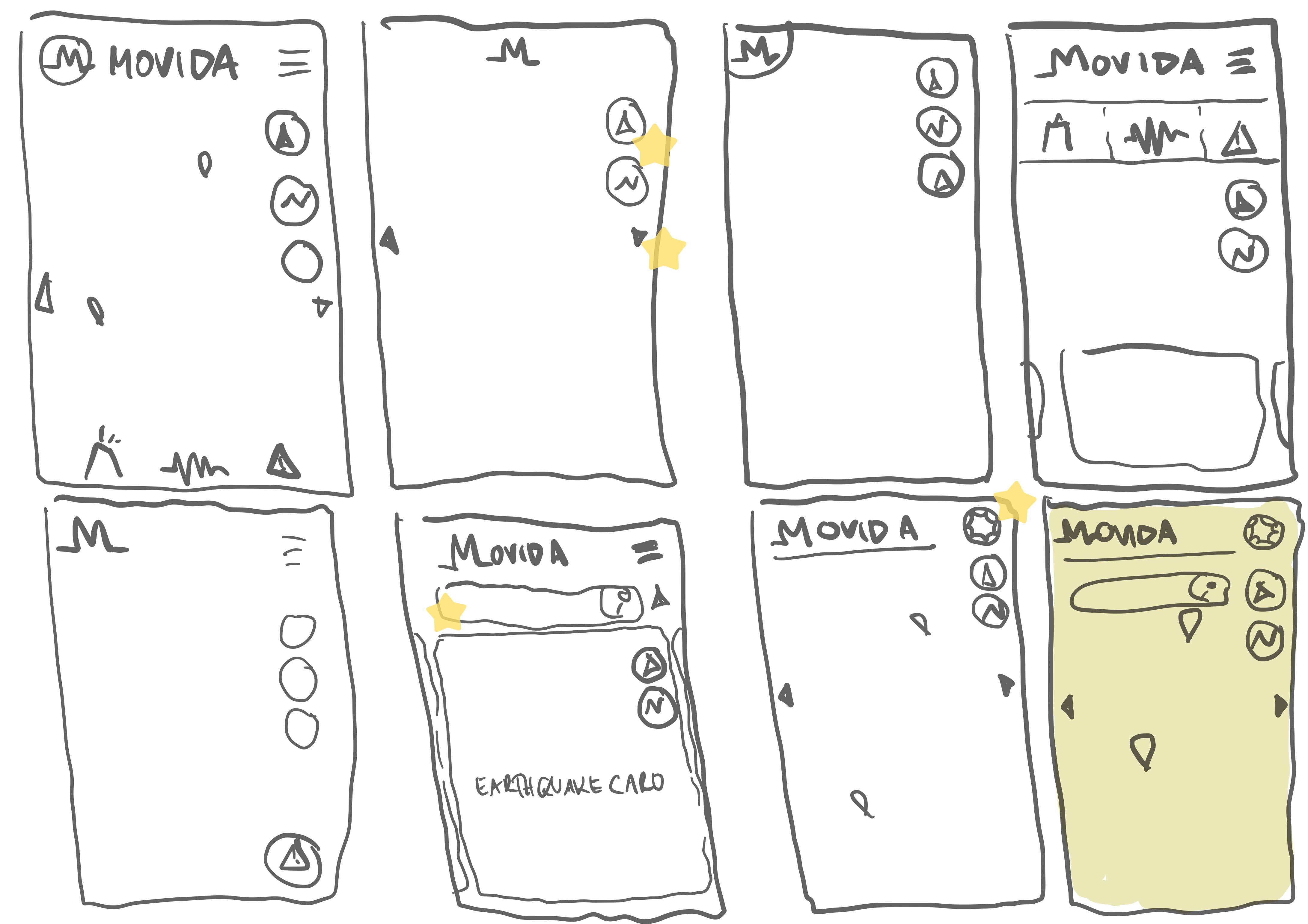
● ● ●

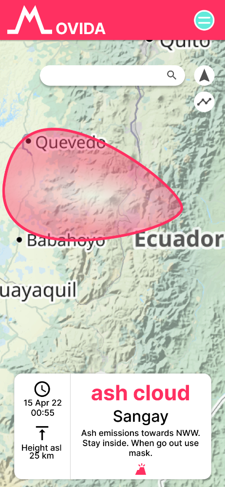
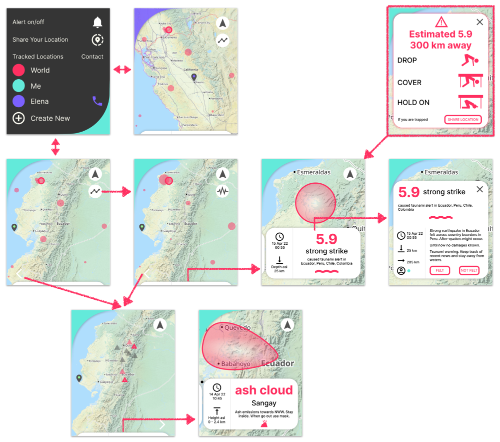
A smartwatch is such a small device that I needed to find ways to make it easy to use and informative enough at the same time. Here is a screen informing about a natural disaster displayed on the background map.
4 participants were asked to perform tasks in a high-fidelity prototype. I wanted to find out if the flow is intuitive and selfexplaining.
● ● ●
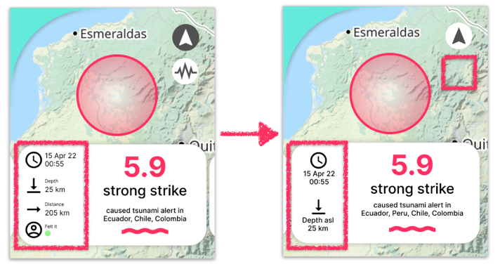
For a smartwatch the selected font size was too small. Therefore, I implemented a vertical flow within the info card, which can be scrolled up and down through touch to get all information on "time", "depth", "distance" and "sensed by".
● ● ●
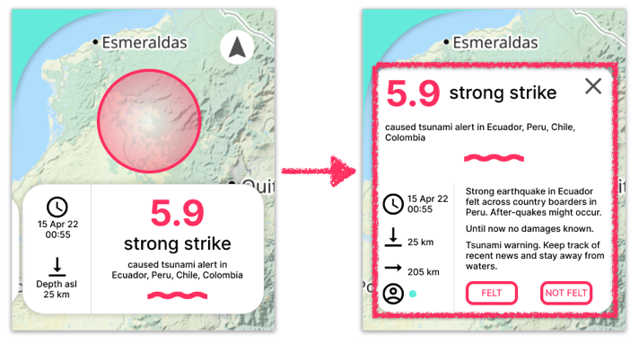
Users wished to receive more information about the individual disaster.
Therefore, clicking on the info card expands it and provides more information about the natural disaster and circumstances. In addition, a feedback option (felt? yes/no) has been integrated.
● ● ●
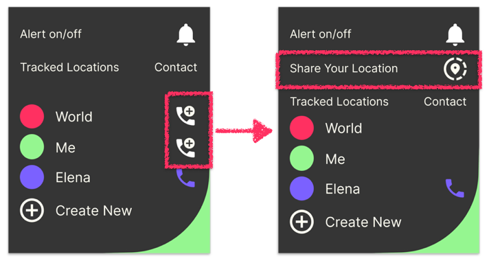
A smartwatch can be especially useful for sending an alert in an emergency.
Therefore, I have integrated a possibility to share the users' location.
In addition, some adjustments have been made to ensure a logic and user-friendly functionality.
● ● ●
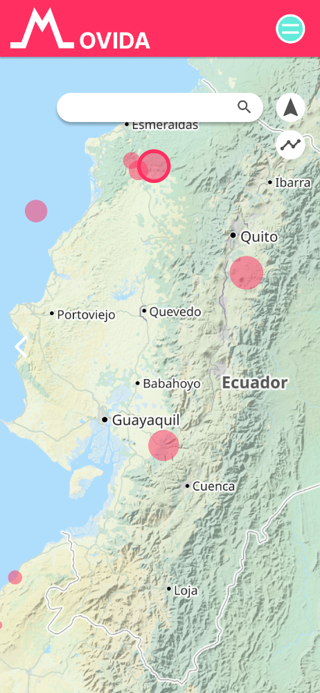
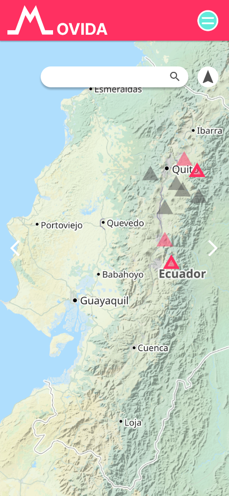
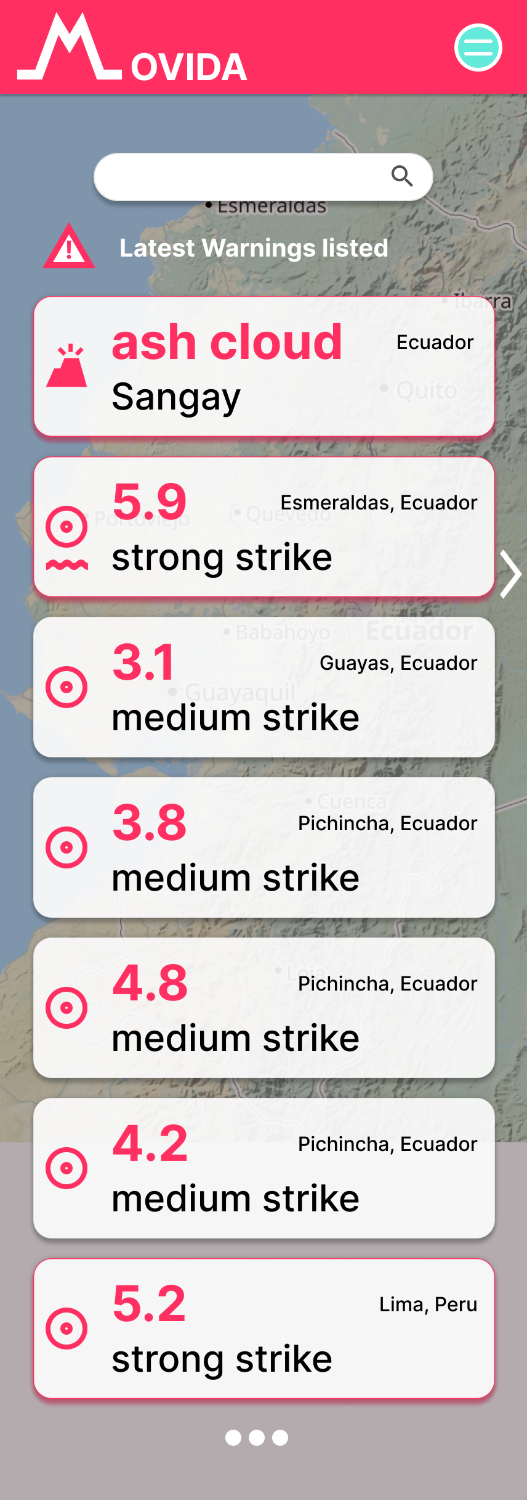
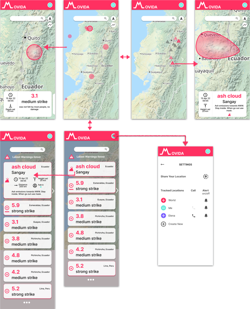
Smartwatch vs Mobile: The functions of the smartwatch app are simpler compared to the functions of the mobile app. Within the mobile app an overview - a timeline - about recent natural disasters is shown. Within the mobile app a user can also search for specific disasters or locations.
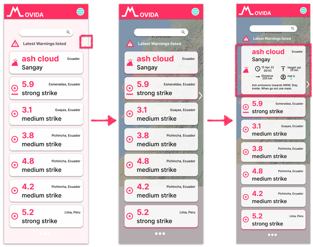
Although the pink background should make the information clearly visible, it turned out that the touch and feel of MOVIDA as shown on the right side are better implemented.
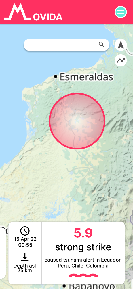
Moreover, users wanted important disasters to stand out more. Therefore, a discreetly placed pink shadow and border was implemented.
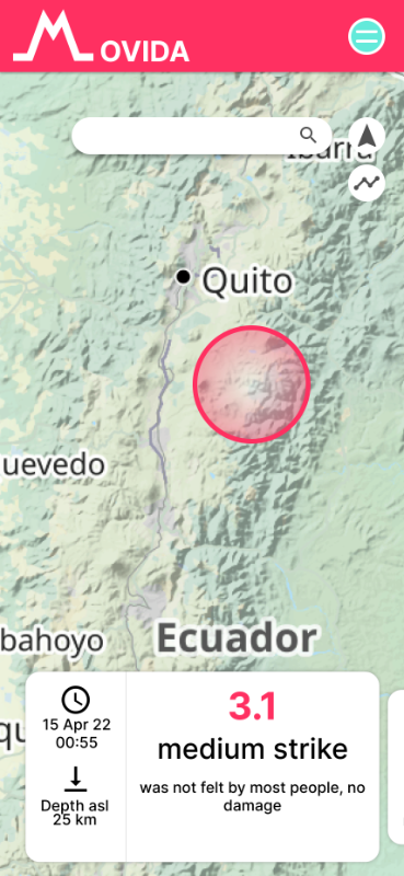
In order to provide an overview and sufficient information at the same time, the user can swipe over the various information messages to extend them downwards.
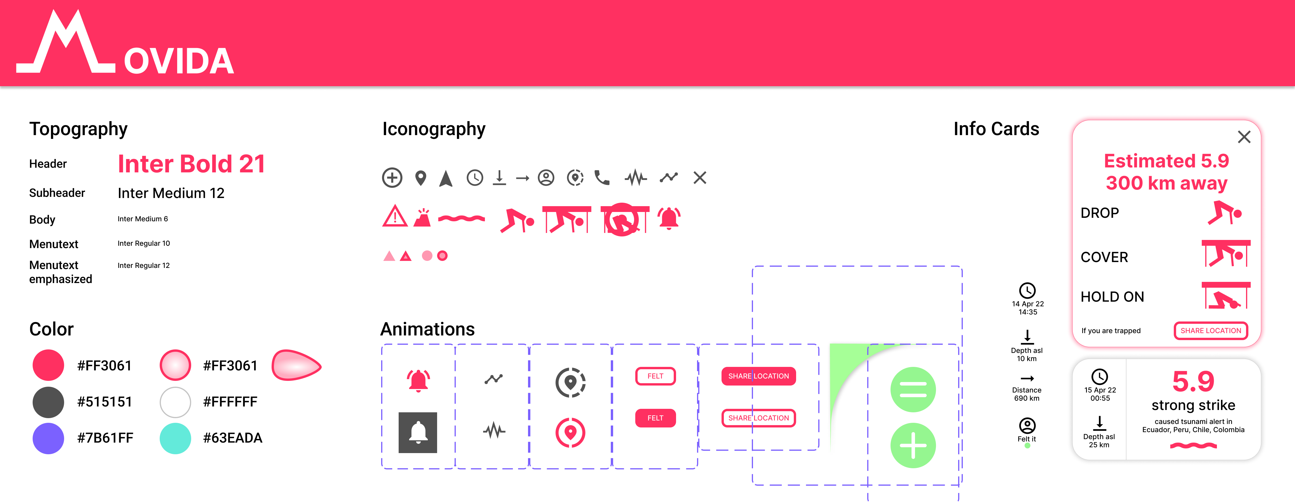
DESIGN KIT
● ● ●
● ● ●
It was very interesting to gain insight and new perspectives from people sharing their struggle with natural disasters. Future work: in addition to iterating my design and gaining more insights from further usability studies, I see integrating more natural disasters such as landslides, plagues and epidemics (insects, diseases) will improve the user experience.
