UX motion designs for a travel app
parallax, microinteractions, navigation flows and transitions
ROLE: UX-designer (Motion Design), 2022
RESPONSIBILITIES: concept, wireframing, prototyping with focus on motion design, mockups
PROJECT VISION
The idea: Translating the motion design processes I have learned throughout the course "Motion Design with Figma: Animations, Motion Graphics, UX/UI" from Andrei Neagoie and Daniel Schifano (Udemy) into a project.
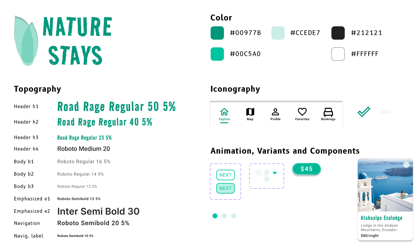
One topic came into my mind - an application for "Naturism". I called it NATURE STAYS. The user can find Ecolodges, Hotels, Farms and other stays that offer a unique experience within nature.
In addition to going through the motion design challenges, I also designed an easy search/filter to retrieve results of the users' interest and thus improve the users' experience with such a product.
Within the course I learned that motion has the potential to connect mental models users have, which finally create a successful product.
CHALLENGES
"Motion tells stories. Everything in an app is a sequence, and motion is your guide. For every button clicked and screen transition, there is a story that follows" (Craig Dehner, formerly on the Human Interface team at Apple)
The challenge was to incorporate motion to support such mental models and guide users through the app. It was also about finding a good balance in terms of motion behaviour - for example, I chose the more calming motion for the navigation bar (see example below).
Another challenge was to integrate a logic sequence of events during the search-filter part.
IDEATION
Initially, I worked on individual movement designs that later translated into a working framework - the NATURE STAYS app. Since my original goal was to simply practice a few different motion designs, I did not draw ideas on paper, but instead puzzled my way to the current layout and workflow. That's not the way a UX Design should be built, but in this case, that's what happened..
Motion helps to improve the user experience and supports usability. It is basically the translation of our mental models into digital motions. For example, clicking a button can be made visually intuitive by developing a three-dimensional button behavior. This gives the user feedback that they would expect in real life. Motion is behavior - not just delight.
Here I present my different motion design pieces.
● ● ●
Navigation transitions. "Motion serves as an explanation to the user of how one gets to-and-from various places in the interface." (Course content)
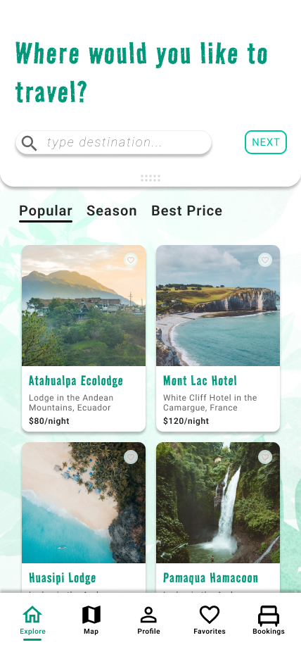
The navigation bar was placed at the bottom of the page - in part because it's easy to interact with it there and move between the different pages of the app.
The navigation consists of five page-links, which are displayed as labeled icons. The active page is displayed in green color. Additionally, a green line below the labeled icons highlights the page the user is currently viewing.
Moving between pages also moves the line between the labled icons. For my final design, I used a simple motion behavior, whereas also providing an example of a more fun motion behavior with a line that behaves like a stretched rubber band and icon animations.
● ● ●
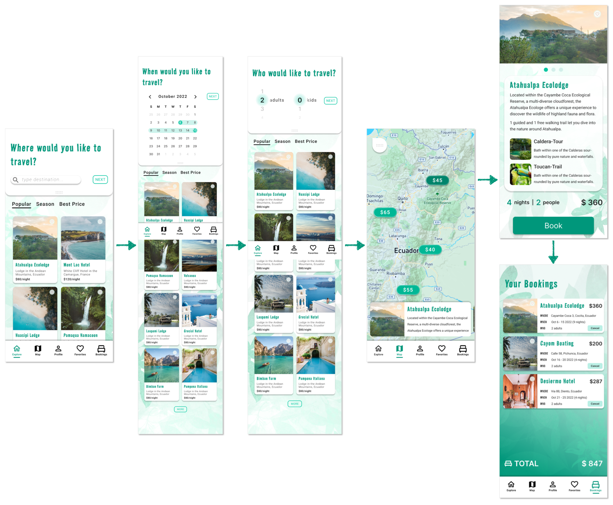
Navigational flow. The search function has been divided into 3 parts (WHERE, WHEN, WHO). To show that these are connected, they appear one after the other like book pages. One page moves out while the next page moves in.
The NEXT-button remains fixed, which also shows that the different pages are connected. The NEXT-button changes color only when clicked (although this part can be improved to show some click motion as well).
Some other small details are integrated, such as the movement WHEN the departure day is set: a larger circle represents the user's finger click, which gets smaller to become the bar representing the total stay. When selecting WHO, the slider mimics a 3-dimensional number wheel.
● ● ●
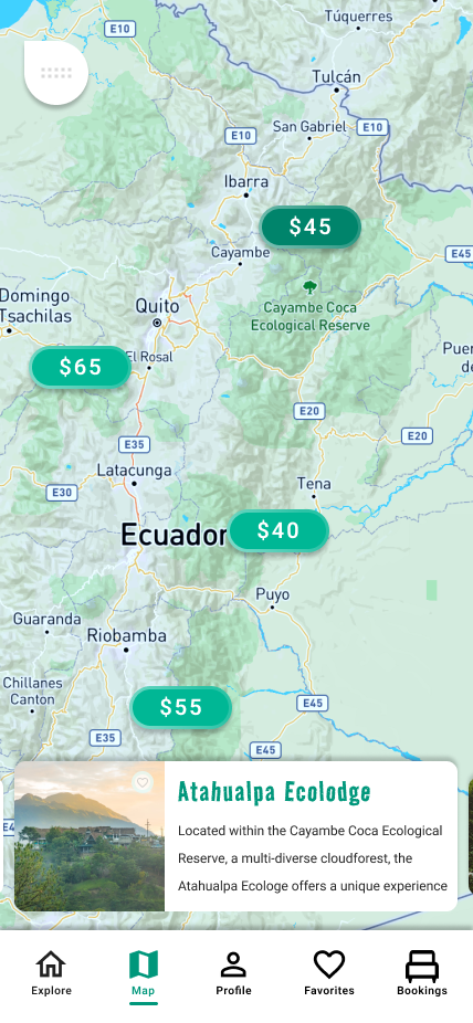
Map flow. When the user entered his/her search (WHEN, WHERE, WHO), he/she will be shown the map view with results in the form of price-tags on the map and NATURE STAYS cards at the bottom. According to the displayed NATURE STAYS card, its price tag is marked darker.
In addition, after the search, an info bar is displayed at the top, giving an overview of the individual search entries. To view the map without the bar, it can be closed by swiping or clicking it. More details are to be implemented to make this more clear.
Besides of that small overview above, movement when swiping between NATURE STAYS cards is integrated. Dragging the visible card to the left or right results in a smooth transition, while the cards to the left and right of the visible card become smaller - they move into focus.
● ● ●
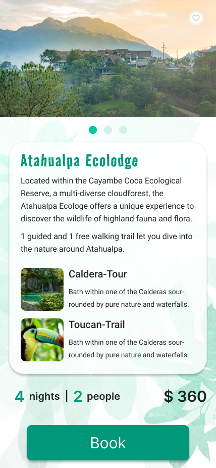
Microinteractions. Each NATURE STAYS Card provides information about the stay within each Ecolodge, Hotel, Farm .... Of course, this also includes images.
The user can slide through the different images by dragging left and right. The slider points of the image slider indicate how many images are provided and how far the user has come in viewing them.
The slider point moves mimiking the user's finger behaviour and helps to better understand where he/she is within the flow (forward, backward).
● ● ●
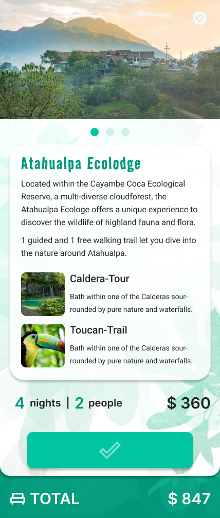
Microinteractions. Each NATURE STAYS card offers a booking option. I wanted to integrate a motion that would inform the user that their request was being processed, ultimately informing the user if the booking was successful. This was achieved by integrating interactive and visual cues.
Clicking the "Book"-button results in a visual change of the button itself, finally leading to a "Booked"-button. The motions inbetween both stages contribute to understand the booking taking place and being processed.
If the booking is successful, the NATURE STAYS card shifts upwards, revealing the "Bookings" content. When the user drags the card upwards, he/she gets to the "Bookings".
Such cues imply that there is some sort of cause and effect.
● ● ●
Parallax. A motion Design that I find very appealing.
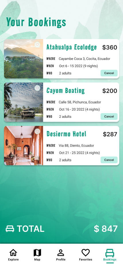
Here I implemented a Parallax effect within the "Bookings" section that works as a narative. The user understands that something is being processed (loading cards) and also understands that the order of the cards coming into view is related to their itinerary.
The first booking-card that appears shows the soonest stay. The upcoming booking-cards that slide in belong to bookings further in the future.
Regarding the design of the cards: the booking-cards are designed to always contain information on WHERE, WHEN, WHO and HOW MUCH. The most important information within a travel plan...
DESIGN KIT
