UX design for an animal shelter app
from research to ideation, wireframing and final mockups
ROLE: UX-researcher/writer/designer - part of Google UX Design Certificate Course, 2021
RESPONSIBILITIES: concept and user research, wireframing, two usability studies, prototyping, mockups
PROJECT VISION
This project is part of the Google Certificate Program with the goal of developing a mobile app.
The theme for my project was determined by a platform called "sharpen" that generates random projects. I chose: "Design a specialized mobile app for an animal shelter".
Although the application was to be developed for only one shelter, my vision was to develop an app that could be used by many different shelters to find pet owners that truly fit the animal. This approach and design thinking should support lasting relationships between pet and owner.
The goal was to establish an app that allows finding a pet that matches the searcher's personality, lifestyle and expectations.
Animals waiting in animal shelters for someone to take care of them should get a chance for a new and better life.
CHALLENGES
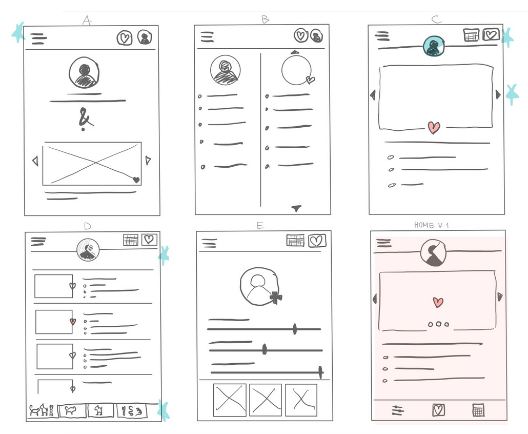
Besides getting more comfortable with my first project in UX design and using Figma, the biggest challenge of the project was to find a simple and intuitive user flow. Users should specify their personality, lifestyle and expectations to find a suitable pet, and not be distracted by beautiful images.
Thus, an easily access and intuitive way to add personality, lifestyle and expectations was needed.
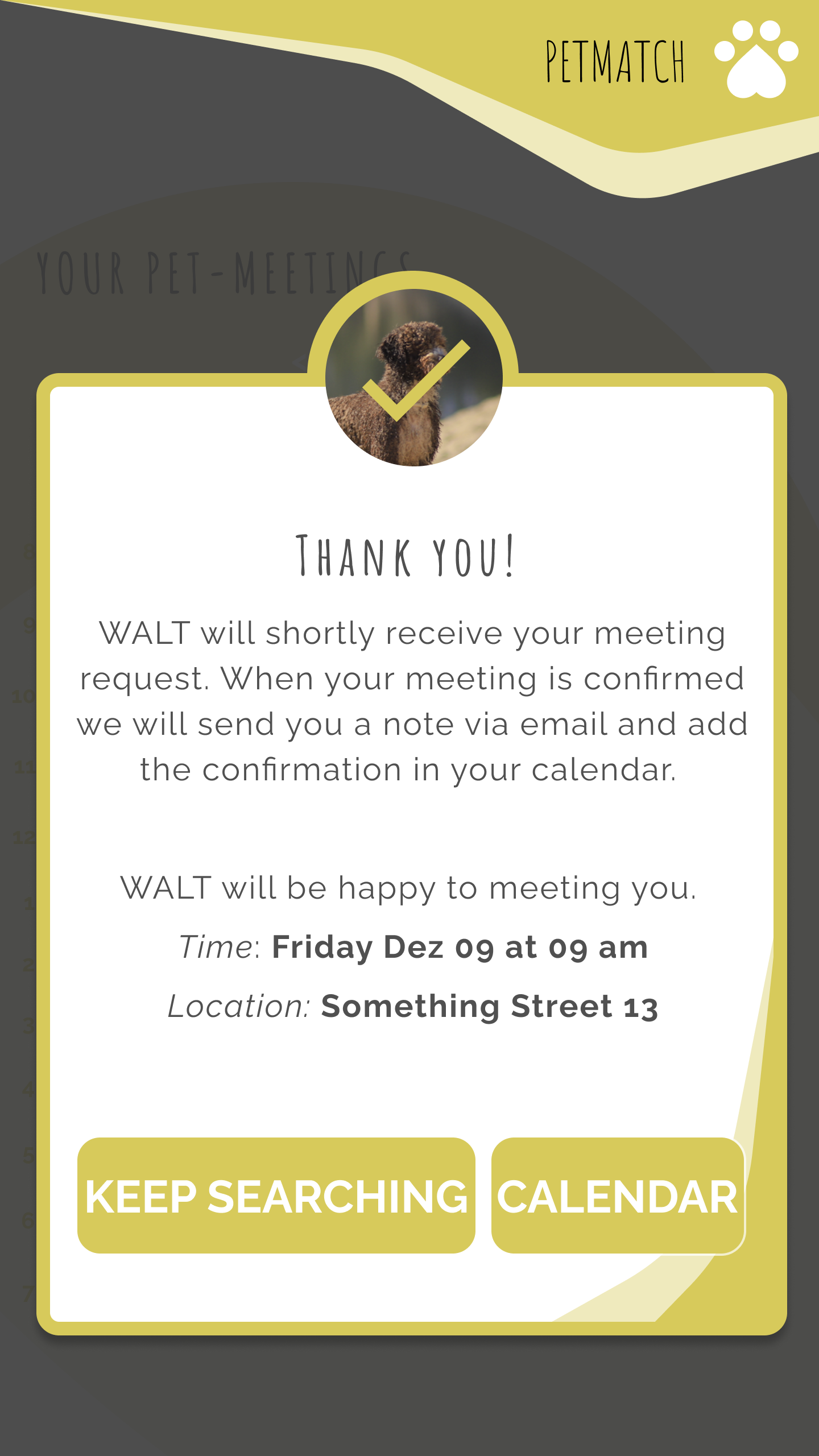
Another challenge was providing a calendar tool for scheduling pet meetings and interacting with the pet shelter. For ease of use, notifications of upcoming meetings are important to avoid frustration.

RESEARCH
5 interviews
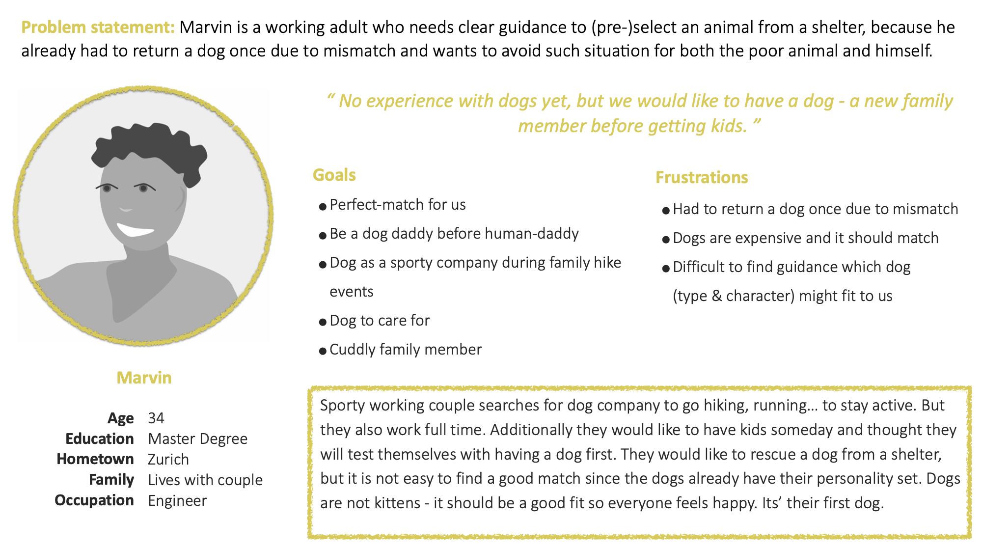
I conducted interviews and created empathy maps to understand the users I’m designing for and their needs. One main user group identified through the research was working adults who have no previous experience with pet ownership but want to help and support animals from shelters.
IDEATION
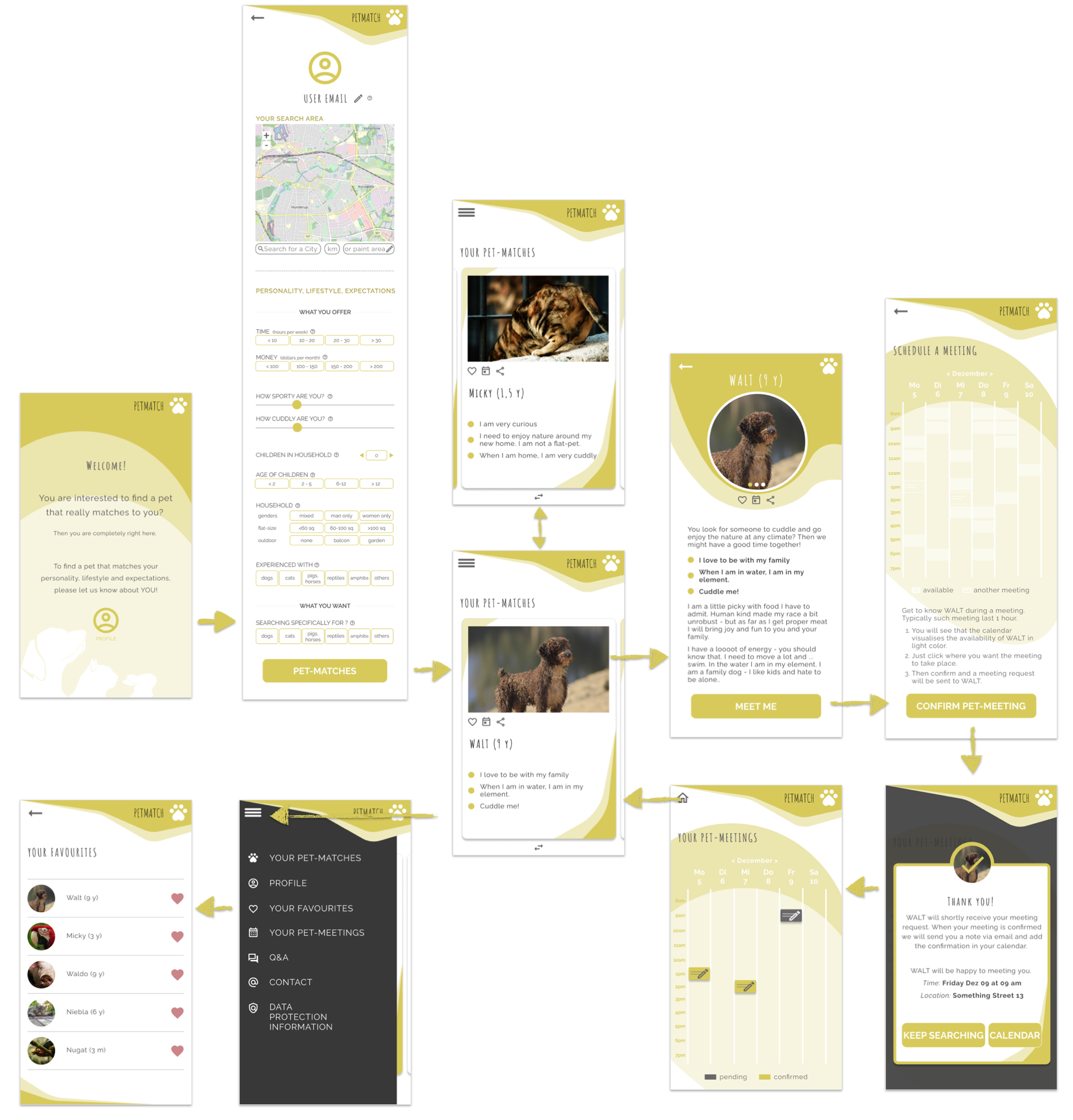
SITEMAP
5 participants were asked to perform tasks in a low-fidelity prototype. I wanted to find out if the main user experience, providing personal information and scheduling a meeting with a favourite animal, is easy for users to complete.
"I want to find a pet close to my house to schedule a meeting easier."
● ● ●
GRANÒ - Homepage.
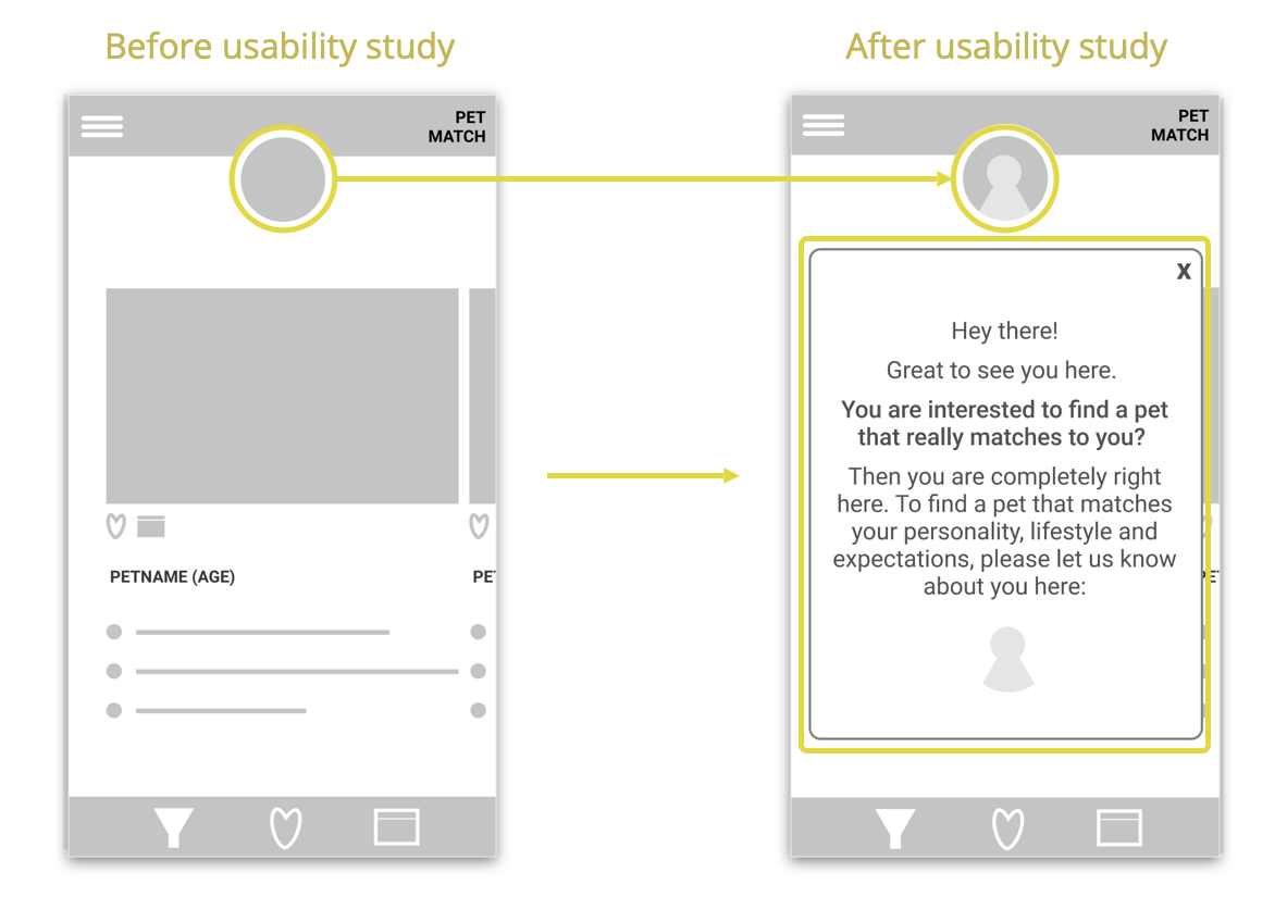
The Profile Identity is improved with a clear Profile picture and an information statement when first opening the app. The profile can now also be accessed via the Menu.
Again, 5 participants were asked to perform tasks in a high-fidelity prototype.
● ● ●
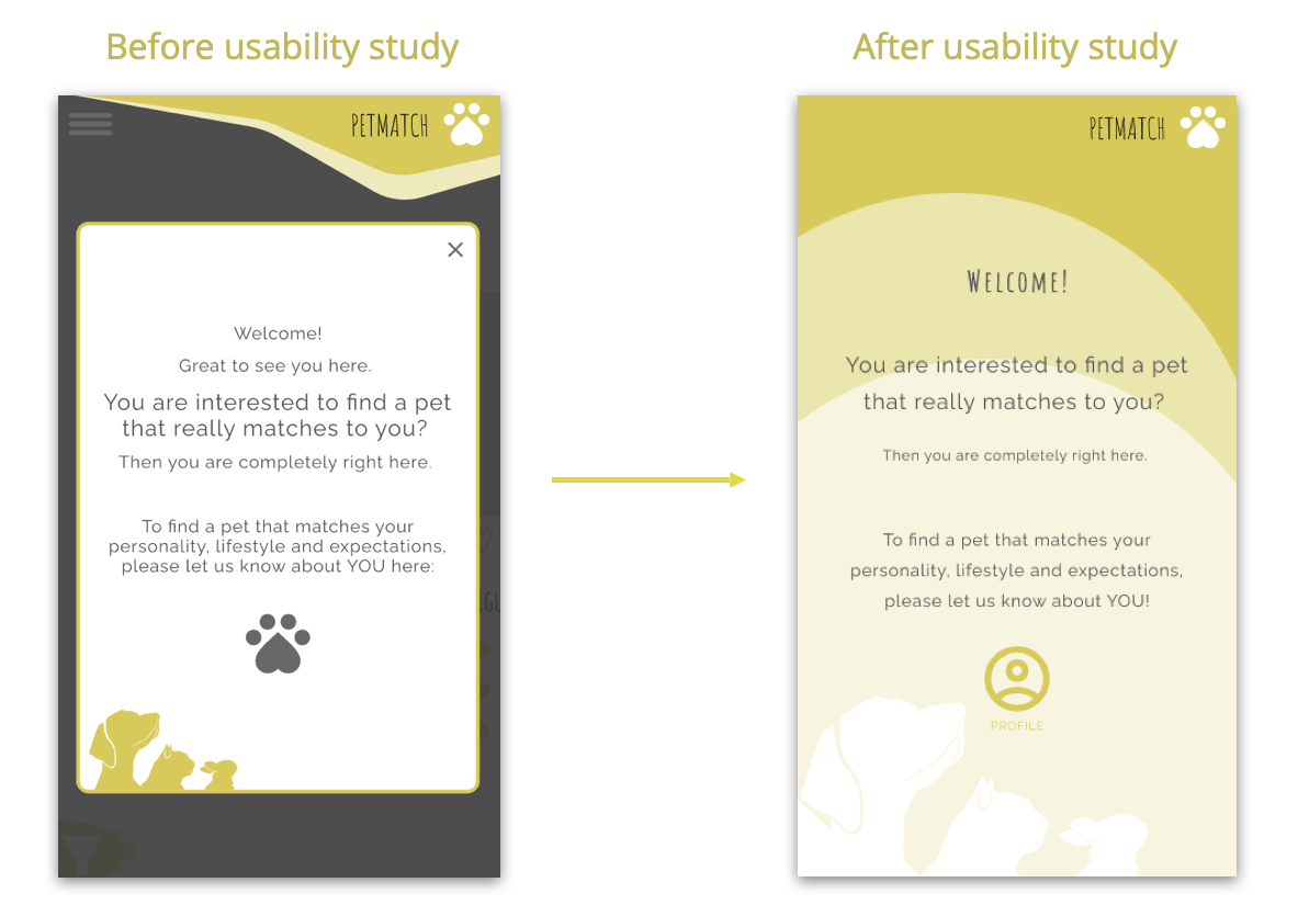
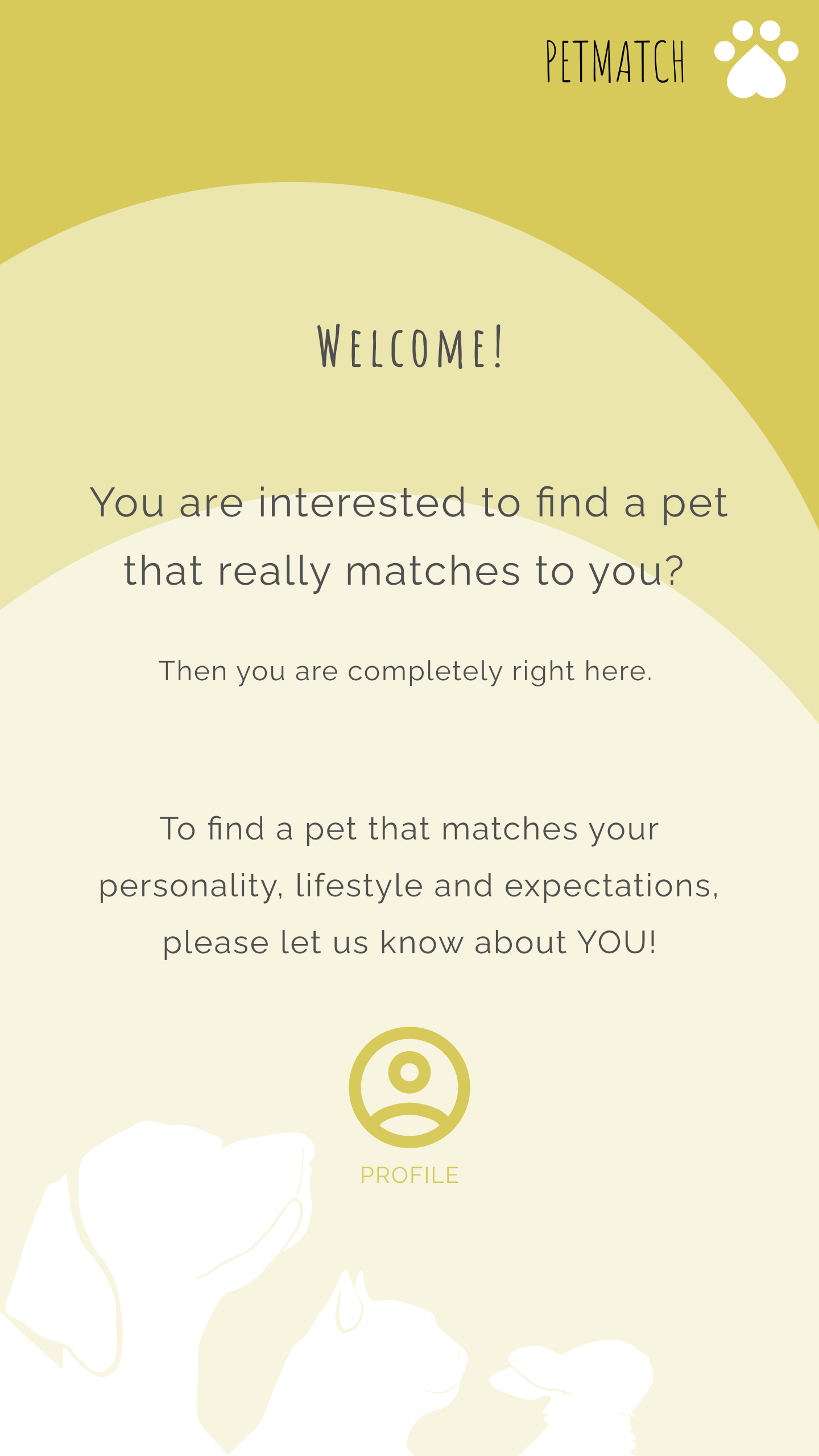
Users shall provide personal information to improve the pet match results. Therefore the start-screen was changed to a SPLASH - screen that informs about the functionalities of the app and already defines the next step: fill in the users' profile.
● ● ●
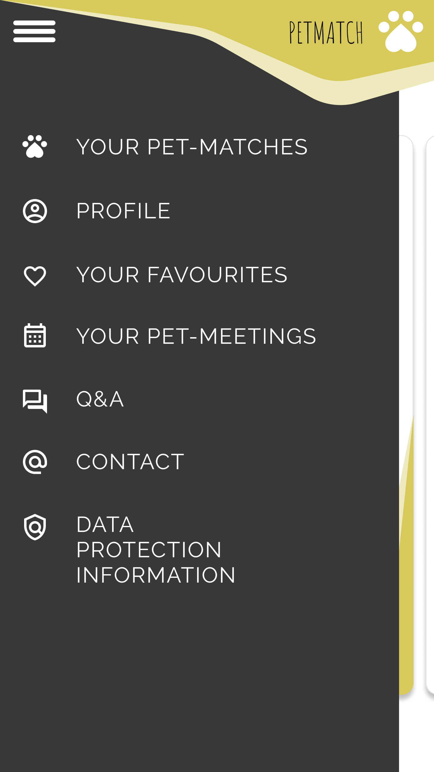
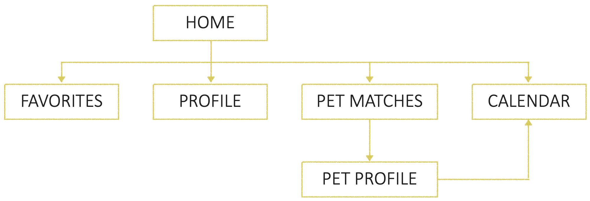
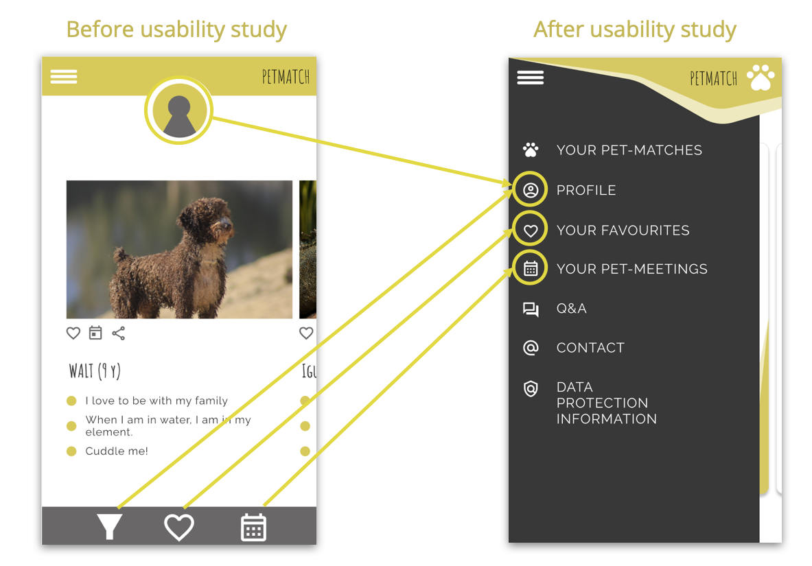
Previously, the home screen was full of options (filter, favourites, view calendar and the profile). Now, these options can be found only within the menu.
Moreover, the filter options are added to the profile settings, where users define their personality, lifestyle and expectations.
● ● ●
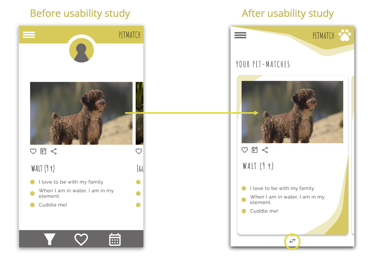
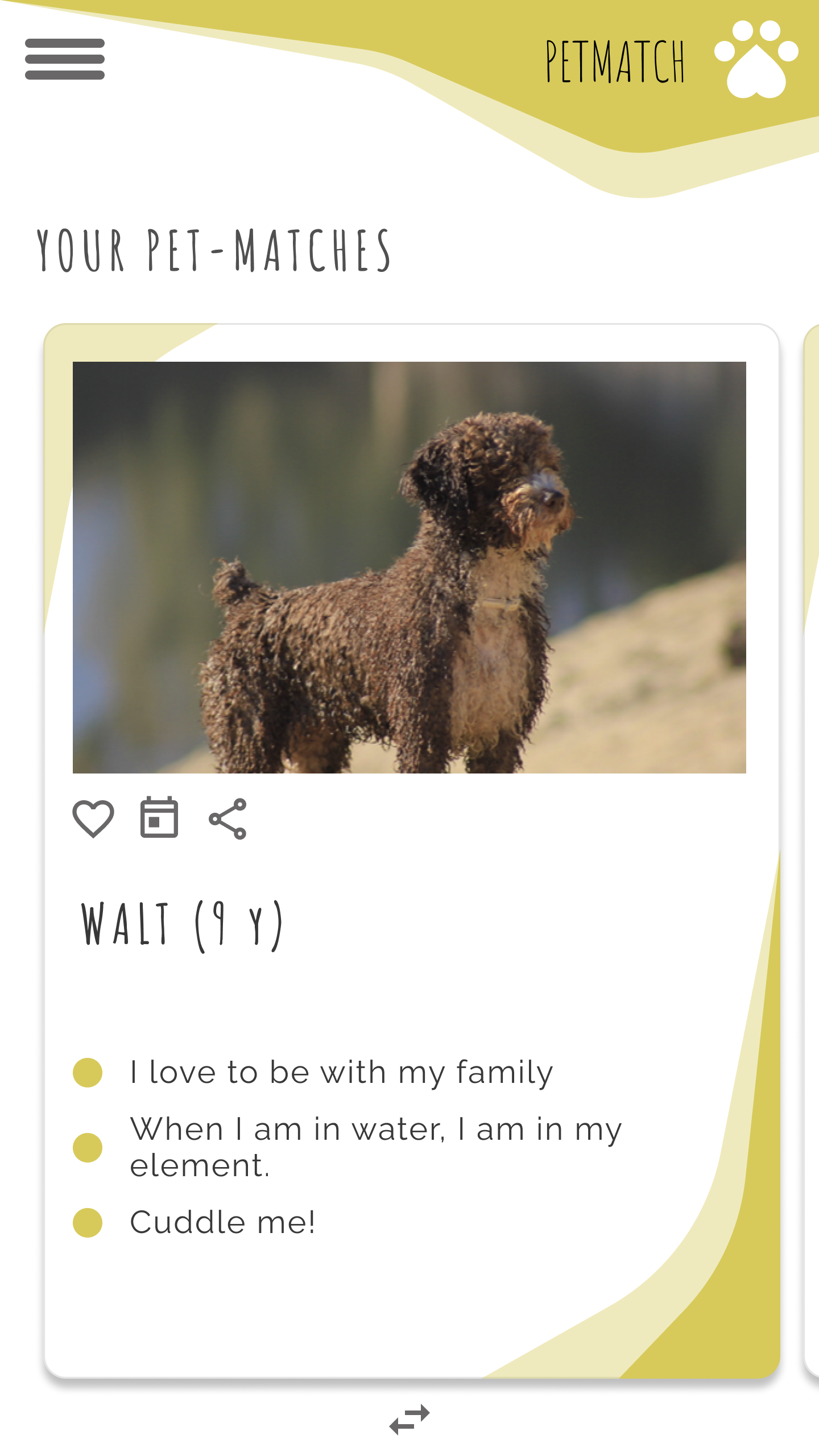
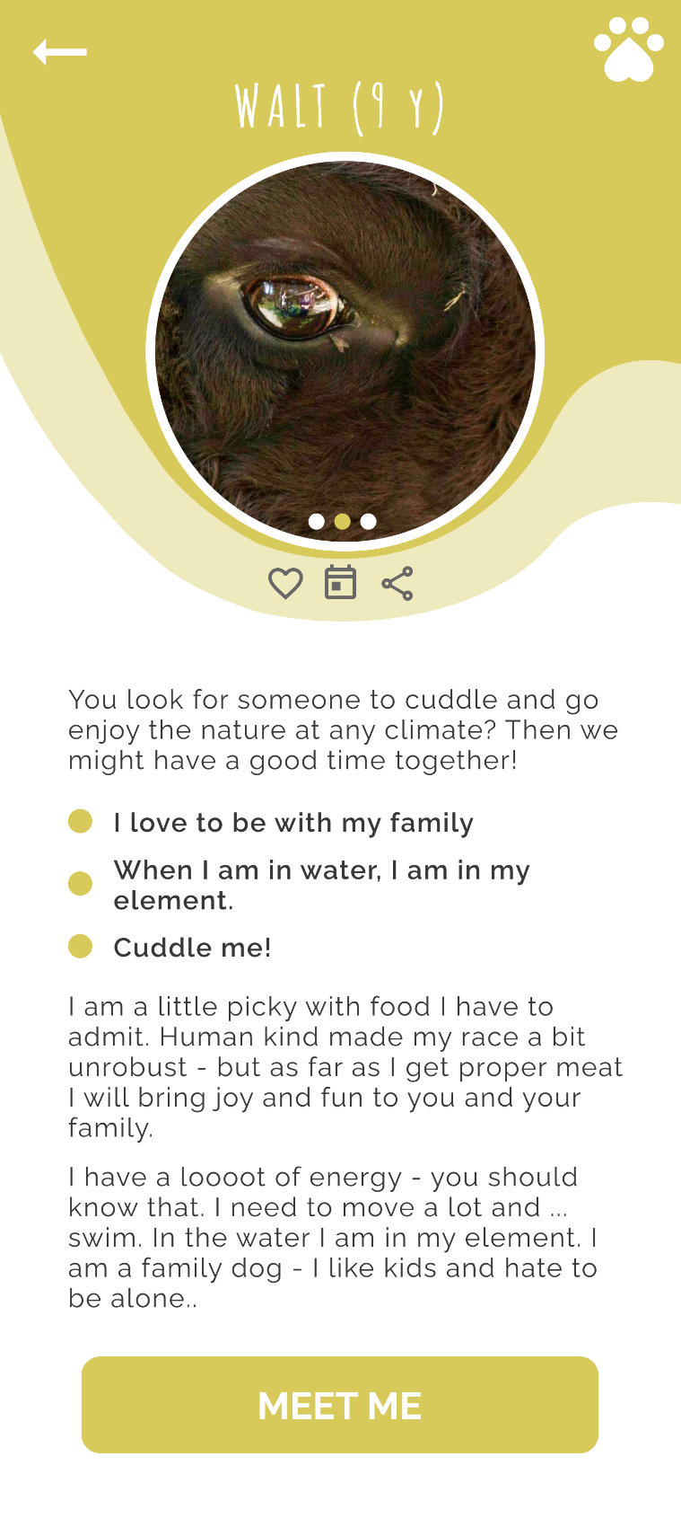
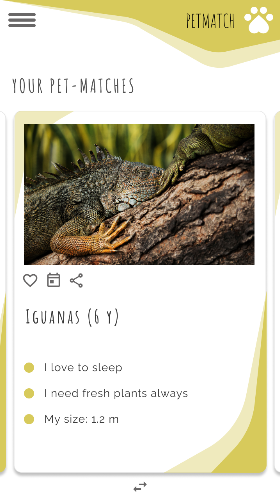
By creating pet cards, the overview of possible pet partners is improved. Clicking brings up more information about each pet. By dragging upwards, the pet cards can be removed from the results. By sliding left and right, the user can view the different pet cards. This is indicated by a small icon at the bottom.
● ● ●
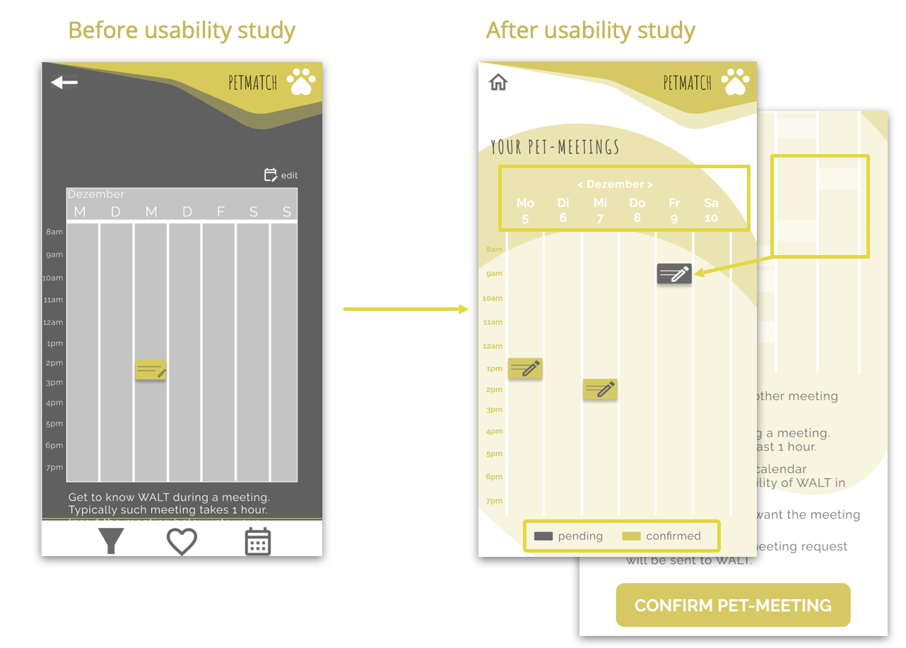
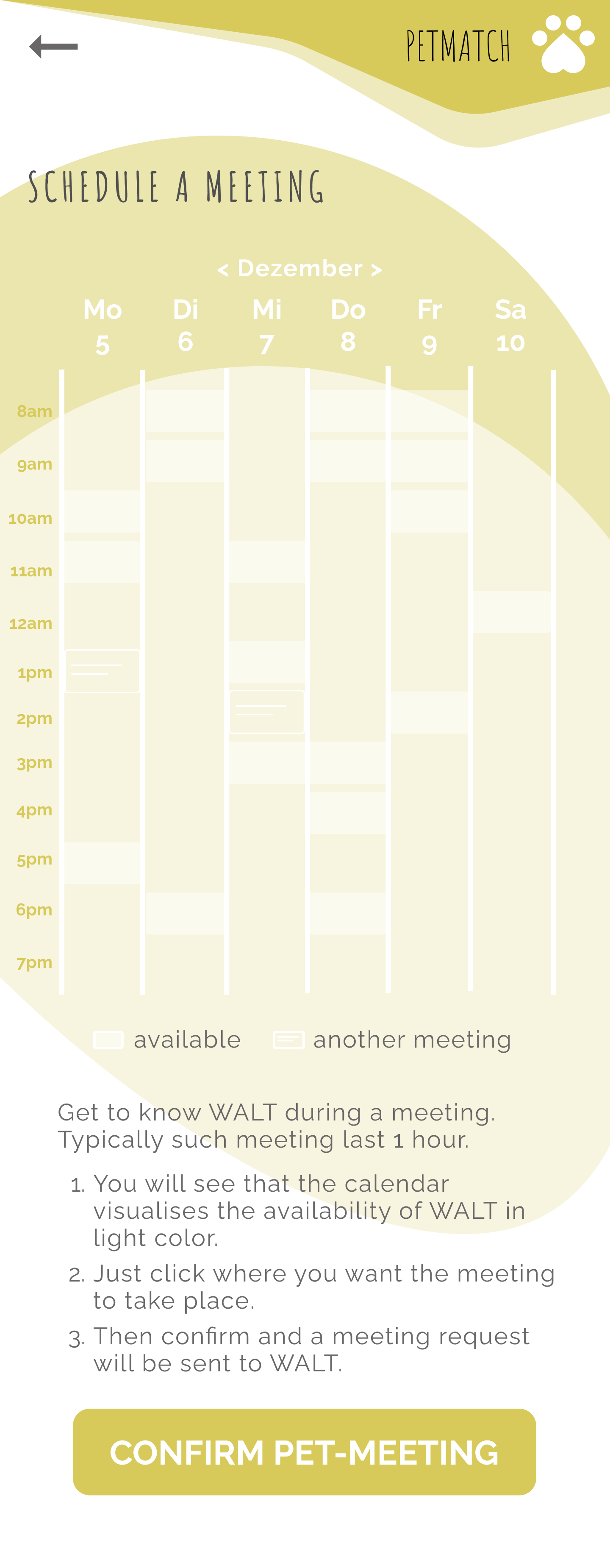
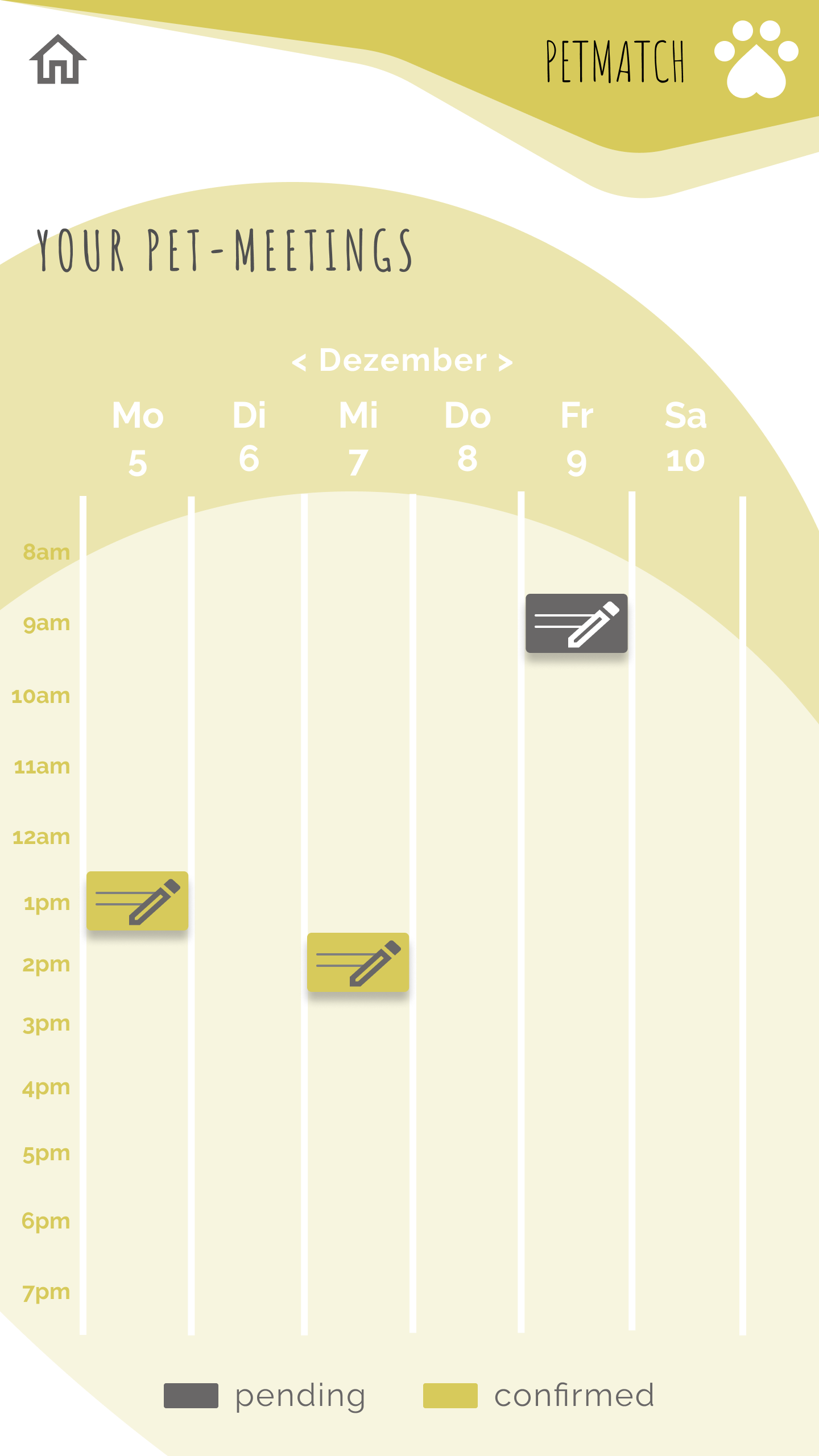
The calendar has been improved by adding an option to switch between months and providing clear information about the day and date. When adding a new session request, available times are highlighted in bright color.
Moreover, a two-color system informs about pending and confirmed pet walks.
