UX design for a responsive shop website
with emphasis on checkout workflow
ROLE: UX-researcher/writer/designer - part of Google UX Design Certificate Course, 2021
RESPONSIBILITIES: concept and user research, wireframing, usability studies, prototyping, mockups
PROJECT VISION
A website for anyone interested in healthy food sustainably gardened by themselves. Manifold fruit and vegetable options provide information about their health value and how they can best support the users. RABANITO also offers a seed exchange.
In addition to creating a responsible design for web and mobile, a special focus was set on an intuitive ordering and purchasing process. Throughout the ordering process, the design should facilitate to keep track of the ordered items.
CHALLENGES
The UX challenge was to present a lot of different information in a way that users could quickly grasp the content and easily maneuver through the application.
Moreover, the purchasing process had to be consistent, intuitive and accessible to all users.
The website also needed to be responsive. It was particularly challenging to integrate a simple and intuitive purchasing process within the mobile view, as the overall space is reduced compared to desktop view.

RESEARCH
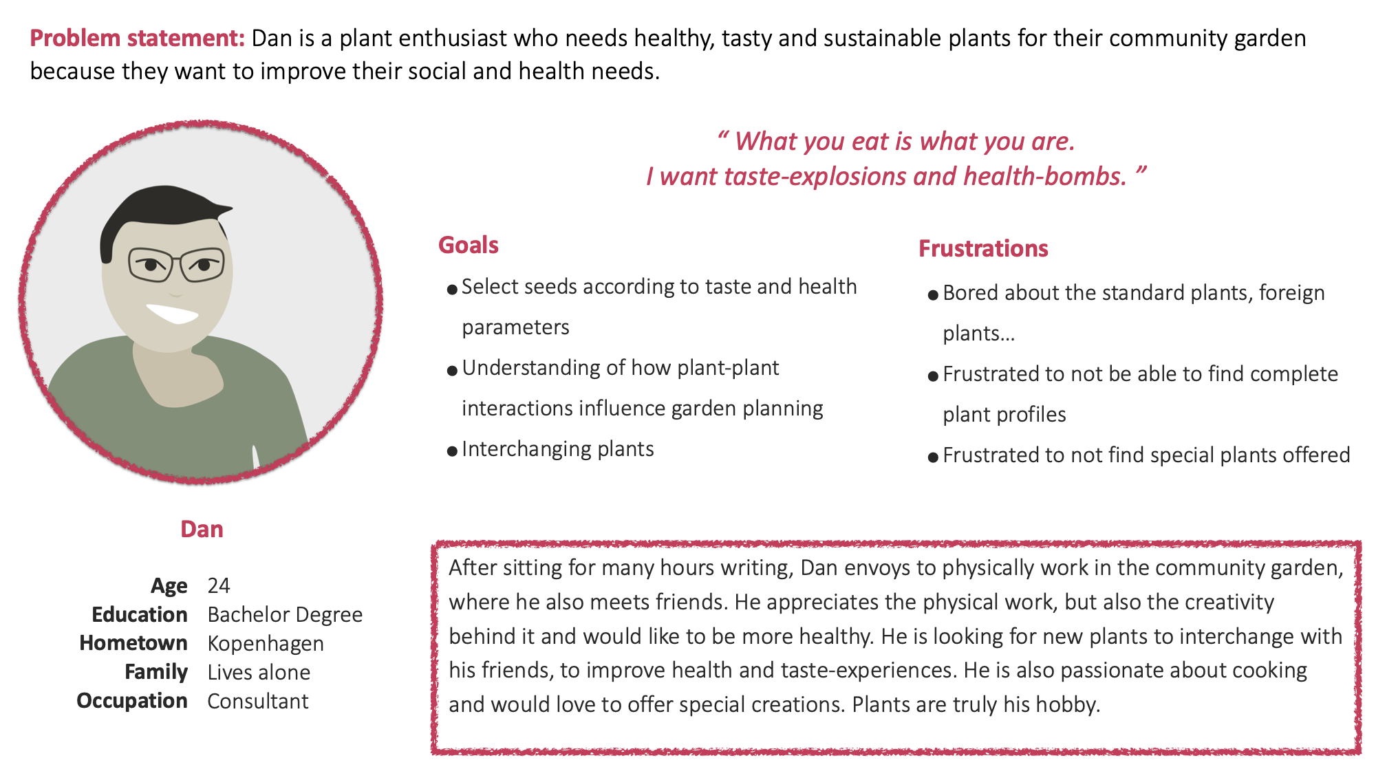
To better understand the market, I conducted a competitive audit and asked friends and family how they receive the available seed market online places. Afterwards I created empathy maps, user personas and user stories to describe the users and user needs I’m designing for.
The primary user group identified through research was young conservationists and hobby-gardeners that see gardening as a possibility to connect with others and create value for nature. They do not want to buy the standards...
One of their most important issues is mitigating and stopping climate change. Hands-on activities and connecting with nature (e.g. community gardens) are key. Institutions like the app RABANITO, which offer rare, healthy and sustainable seeds, can fill a gap in the responsible attitude of young people.
IDEATION
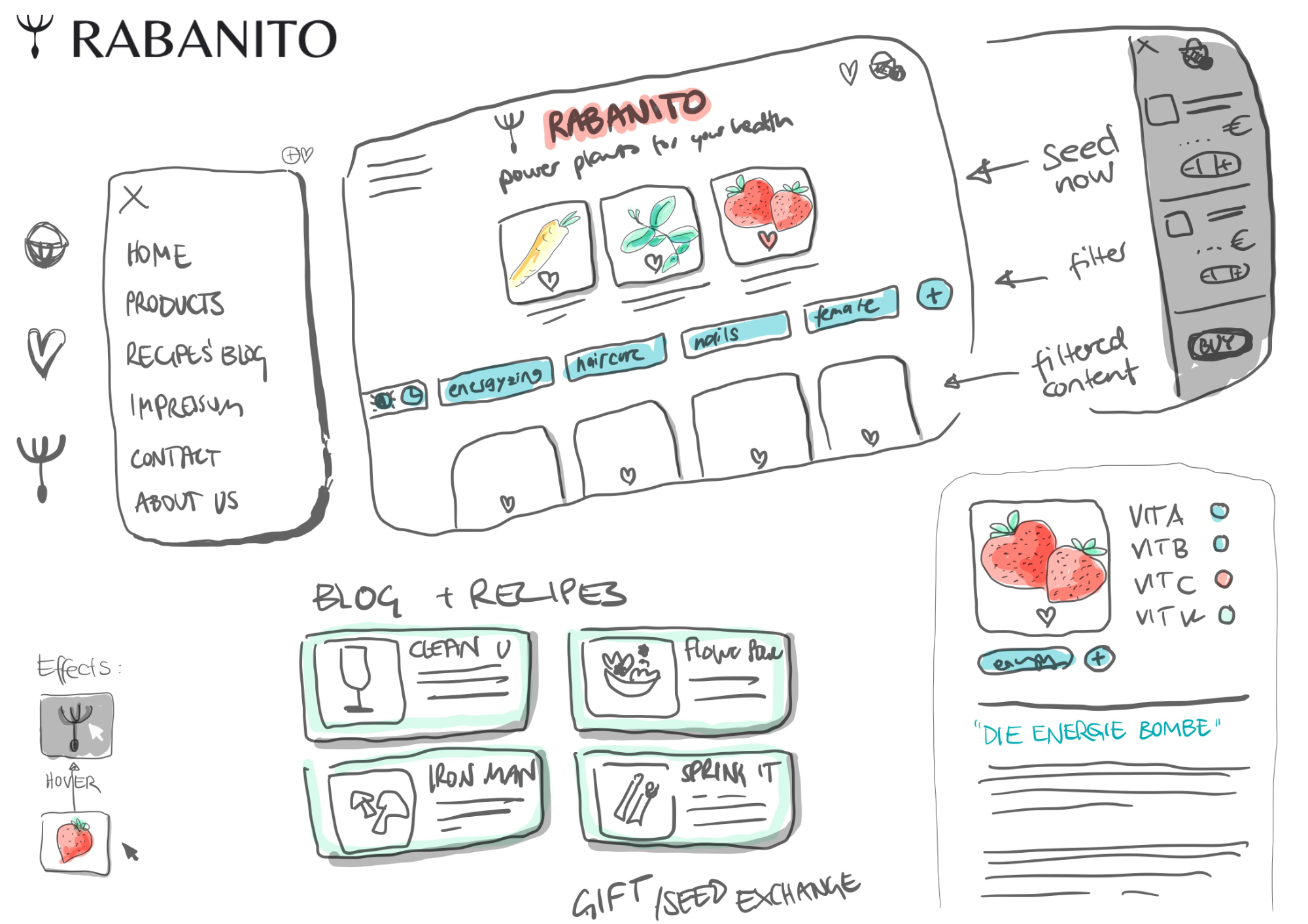
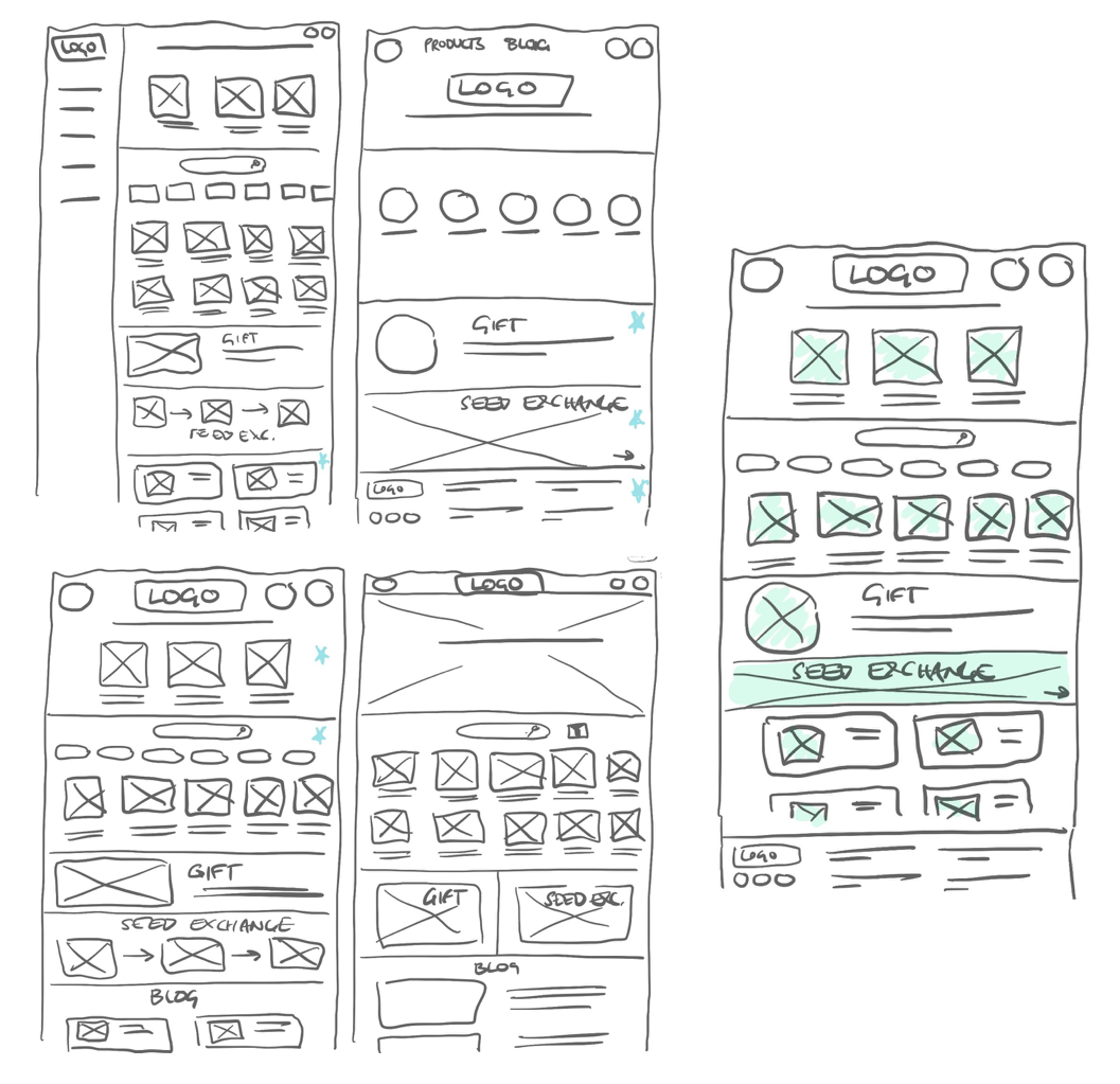
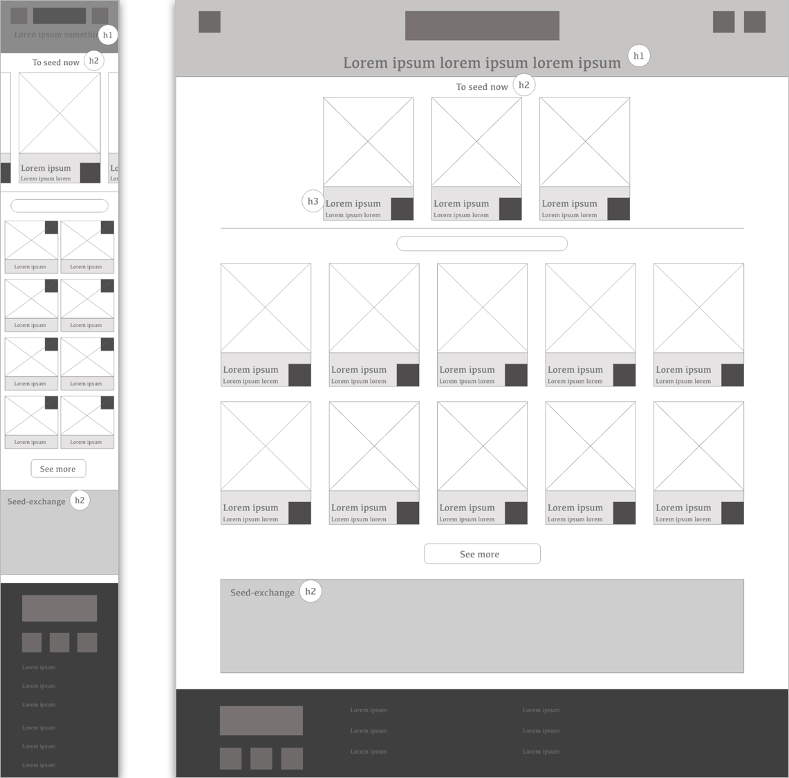
Starting with brainstorming ideas on paper, I realized that there are too many ideas I have in mind. I tried to boil it down to the most important features such as special plant offers, all plant library with information on the plants' health value and the seed exchange as a creative and sustainable community idea. After paper wireframing I transfered my ideas into lo-fi digital wireframes, which I used for a first usability study before the prototyping and mockup stage.
● ● ●
● ● ●
● ● ●
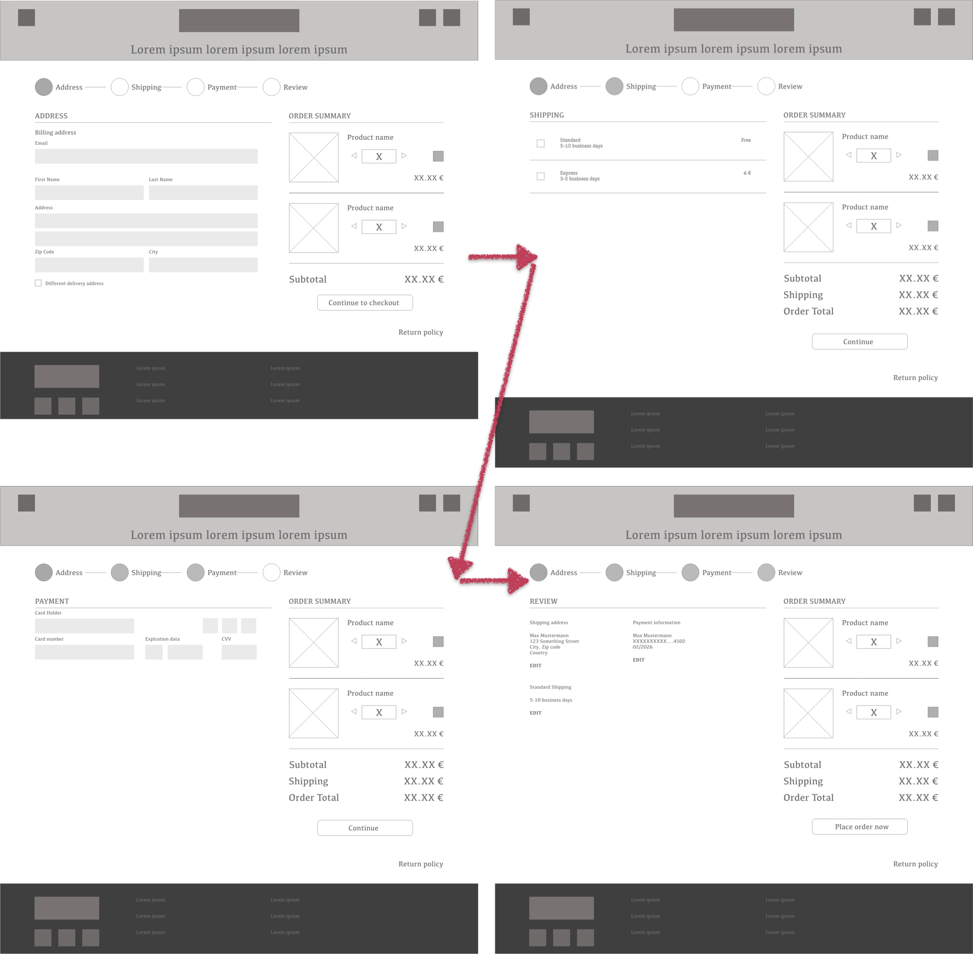
4 participants were asked to perform tasks in the low-fidelity prototype (remote moderated usability study; 30min). I wanted to find out if users understand the difference between the special offers and the general seed-cards, as well as the “How-to” purchase an order.
Unclear Design: The difference between special offers and normal seed-cards was not clear enough.
Clear purchasing flow: I wouldn't have been able to get this right on the first try, but since the Google UX Design course went through the steps of a purchase process beforehand, there were clear steps to follow. Users could easily maneuver through the buying process.
● ● ●
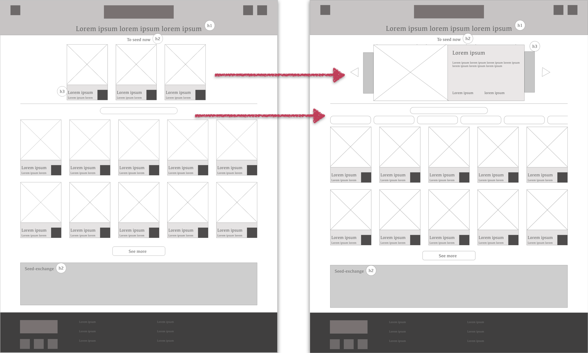
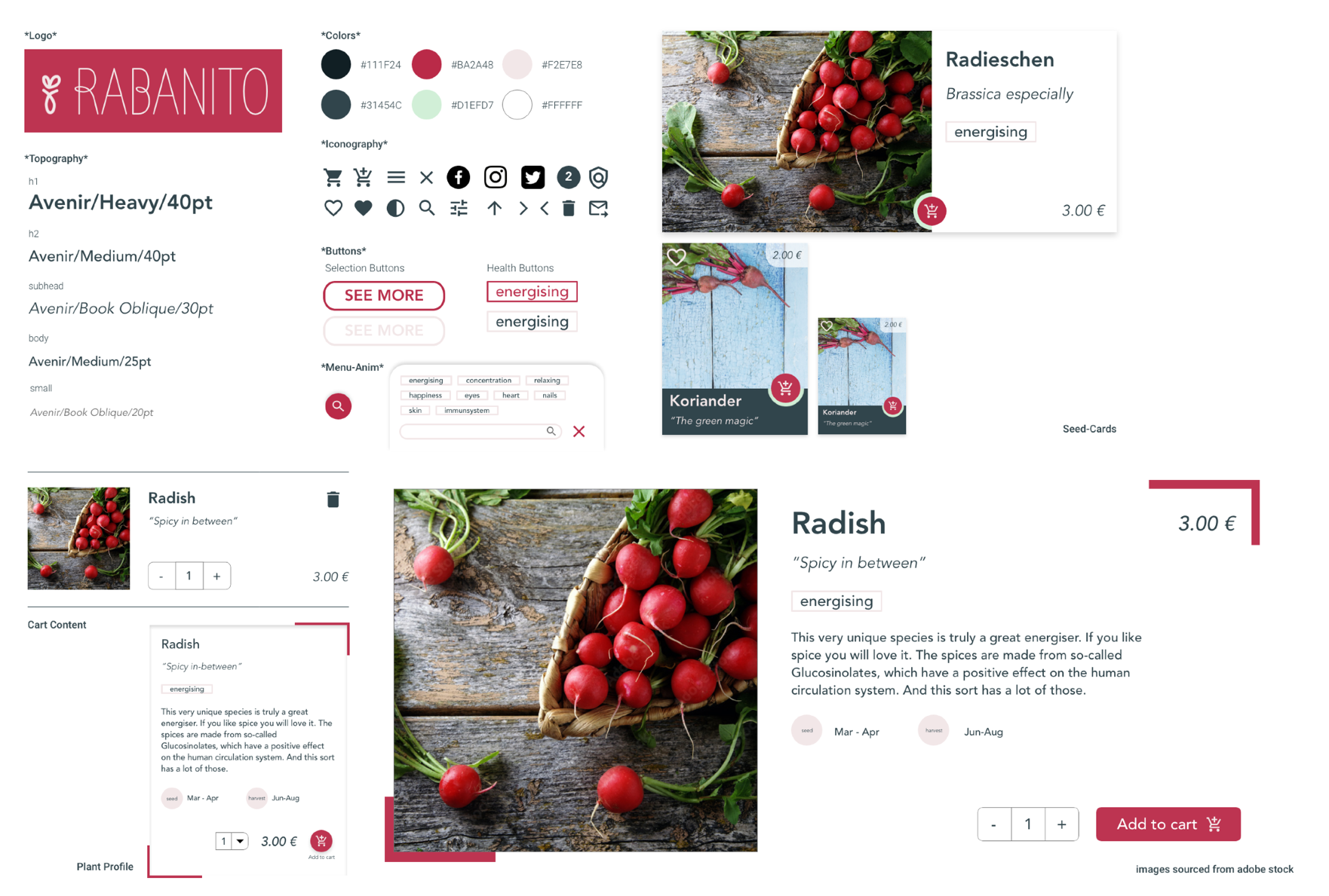
Thanks to the first inputs of potential users, I could adapt the seed-cards such that the 'special offers' are easily distinguishable from the 'general seed-cards'.
Moreover, I also adjusted the search- and filter option, as I did not consider filtering before.
2 participants were asked to perform tasks in a high-fidelity prototype.
● ● ●
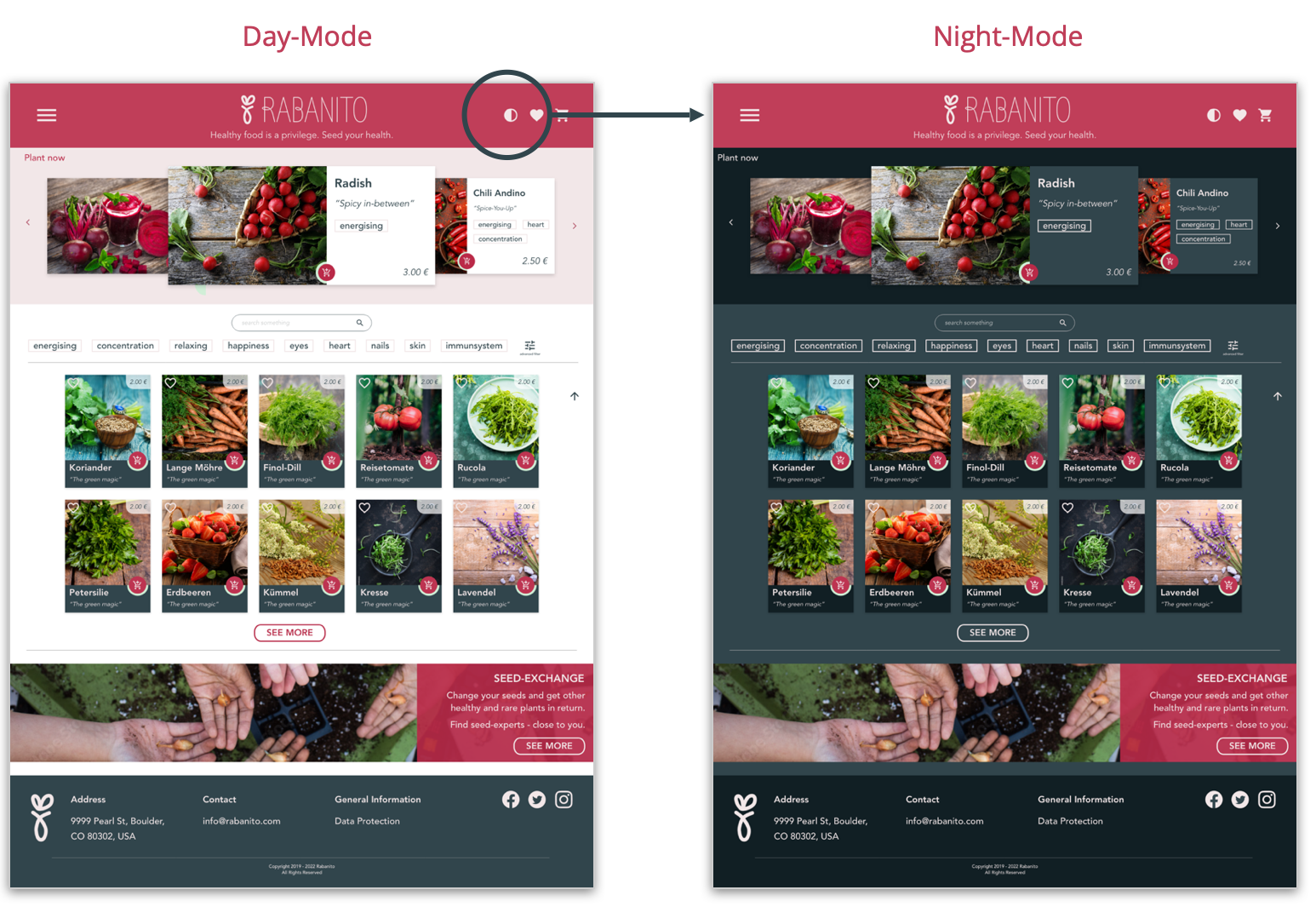
Accessibility consideration: For more comfortable usage, a Night-Mode is integrated. This improves the visibility during night. High contrasts have been used.
● ● ●
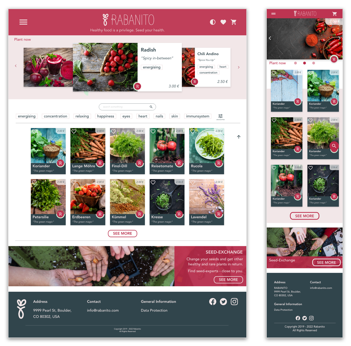
Since RABANITO is a responsive website, a design for mobile was established.
The headline including special offers was set to span the full width of the mobile.
The two-column seed card view below the special offers (mobile) allows a better overview of the seeds offered by RABANITO.
● ● ●
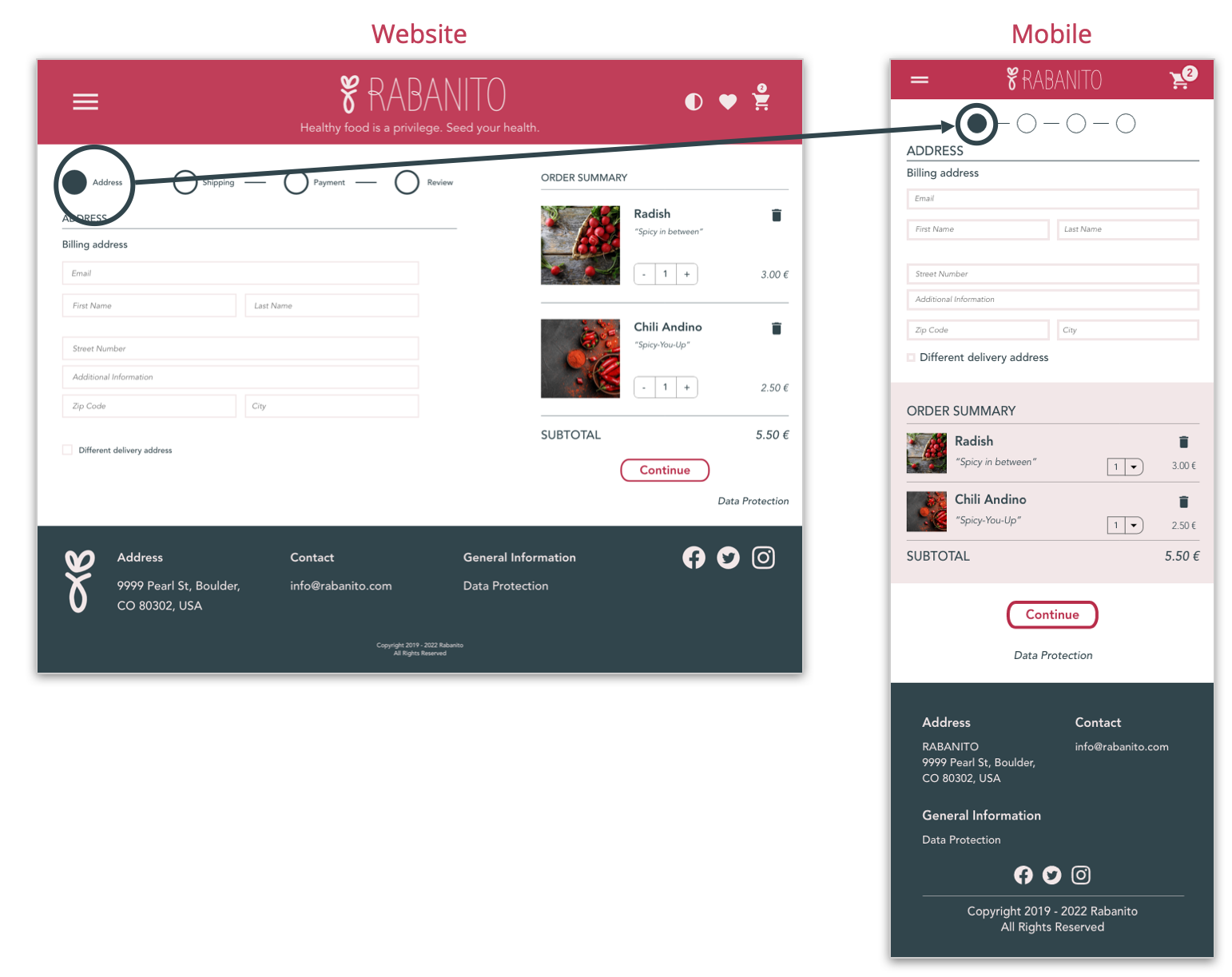
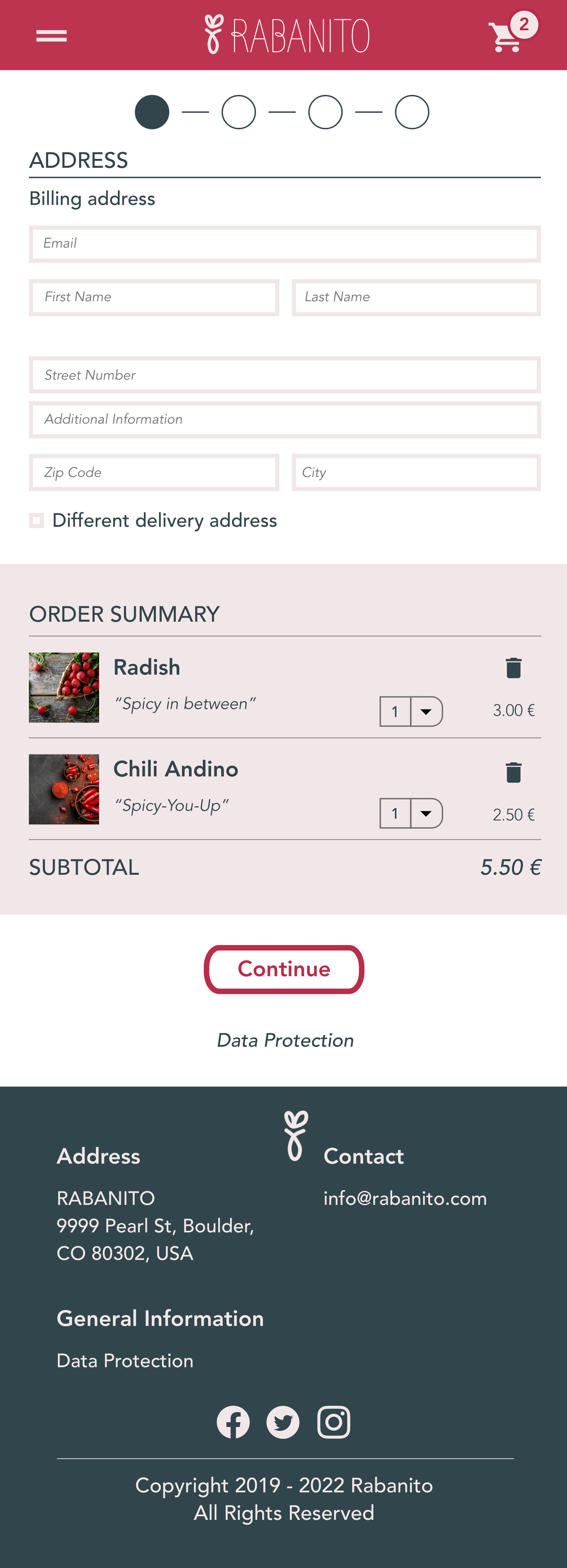
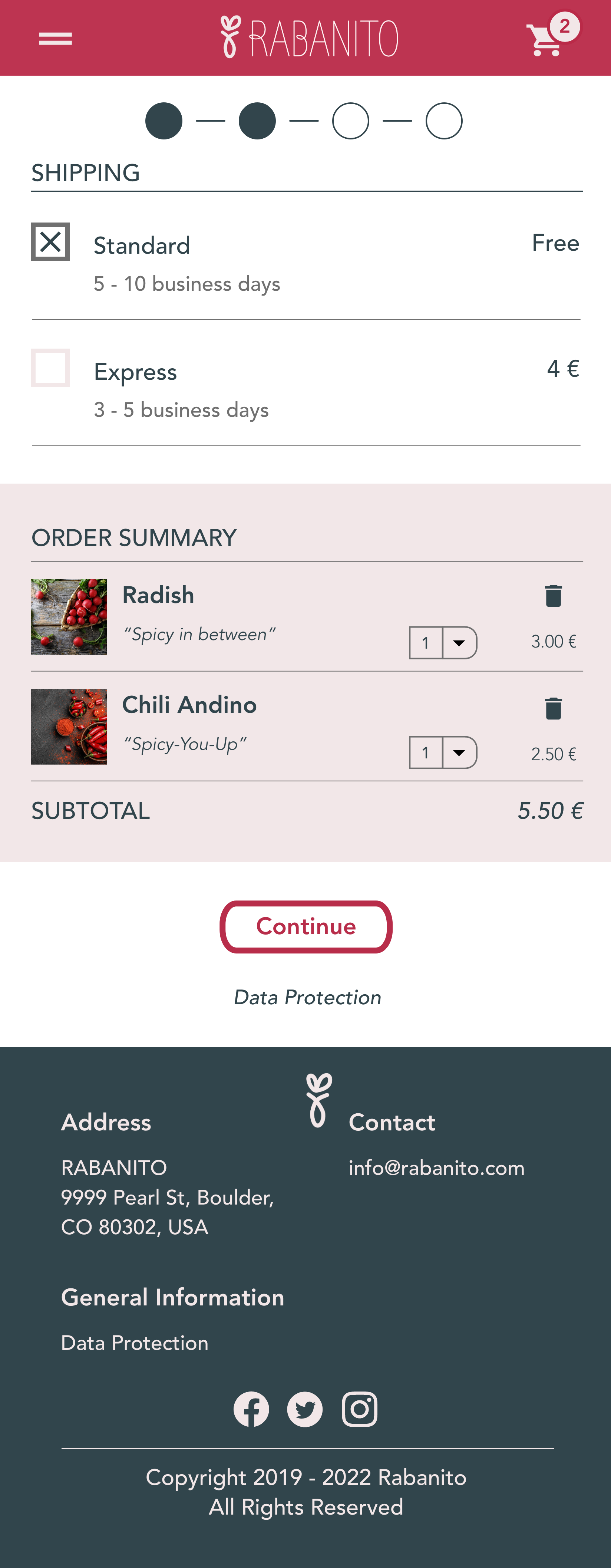
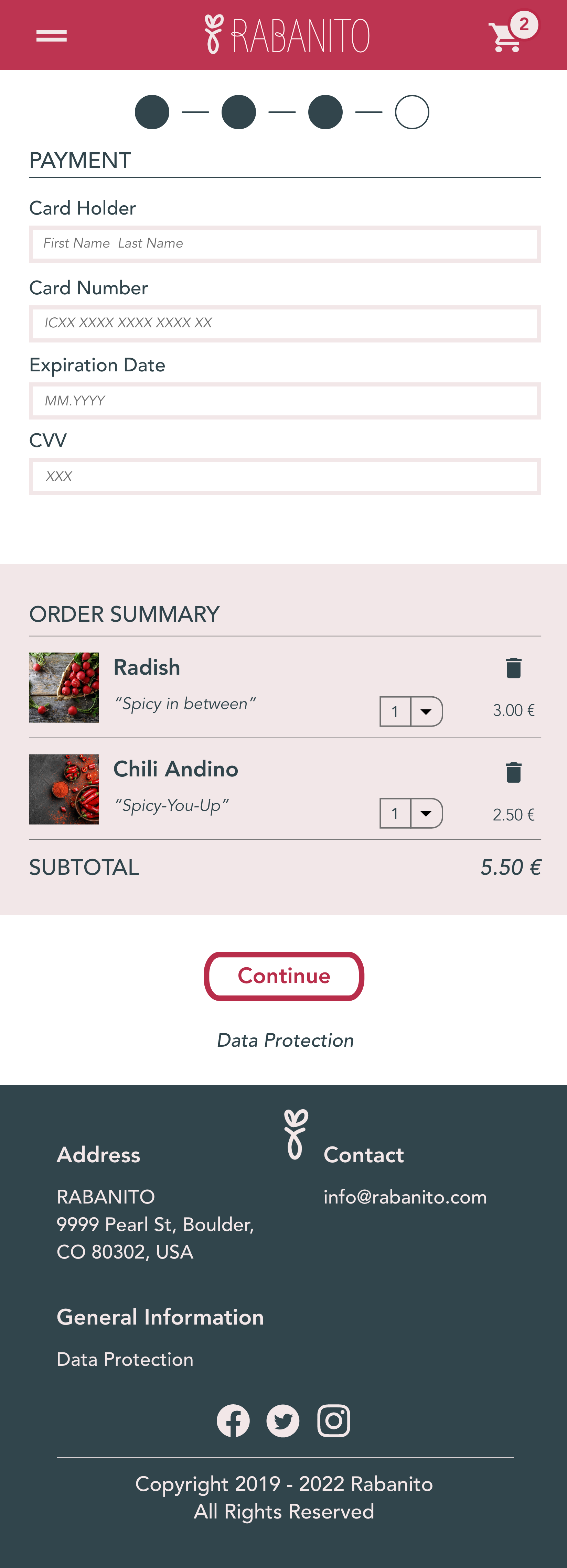
Within Website view, the purchasing process is indicated with additional labels, while the mobile view does only show the current step as filled header points without labels.
Moreover, in mobile view I colored the background of the cart items to clearly seperate the cart from the purchasing process.
● ● ●
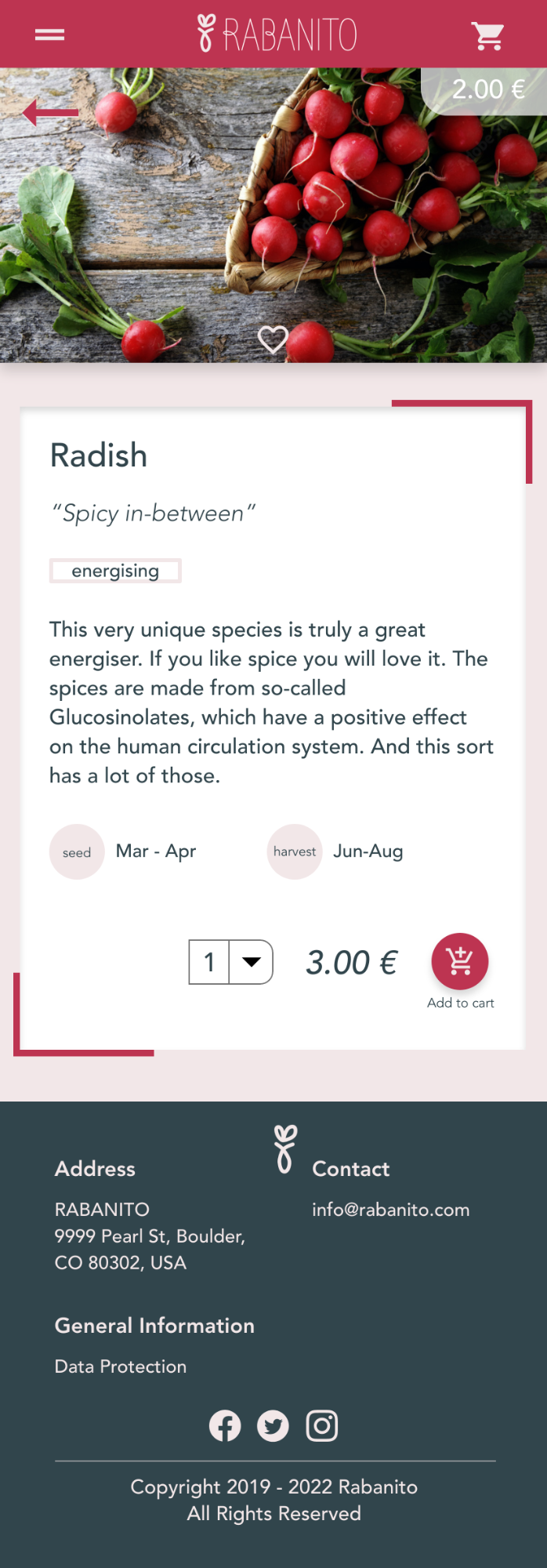
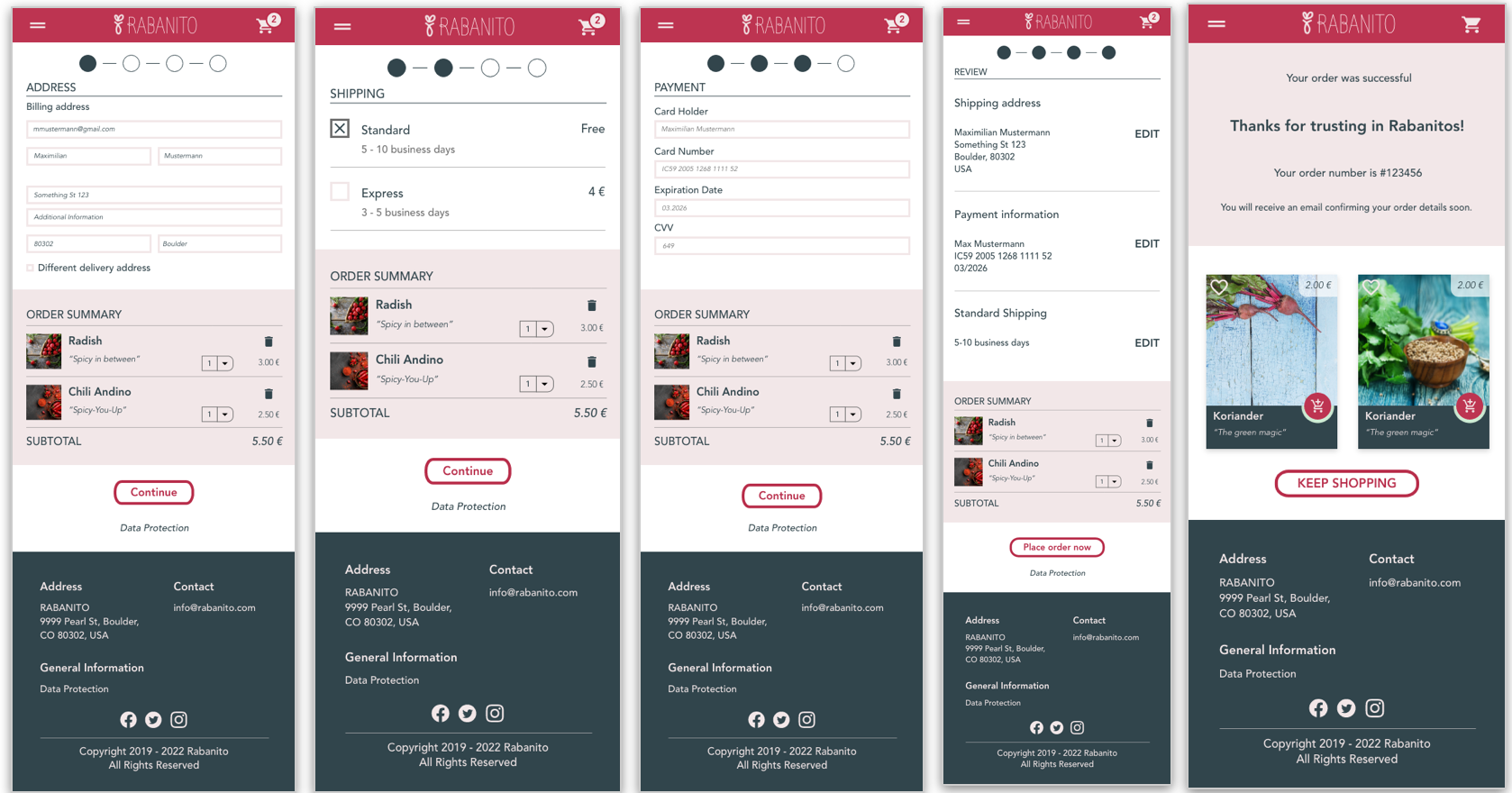
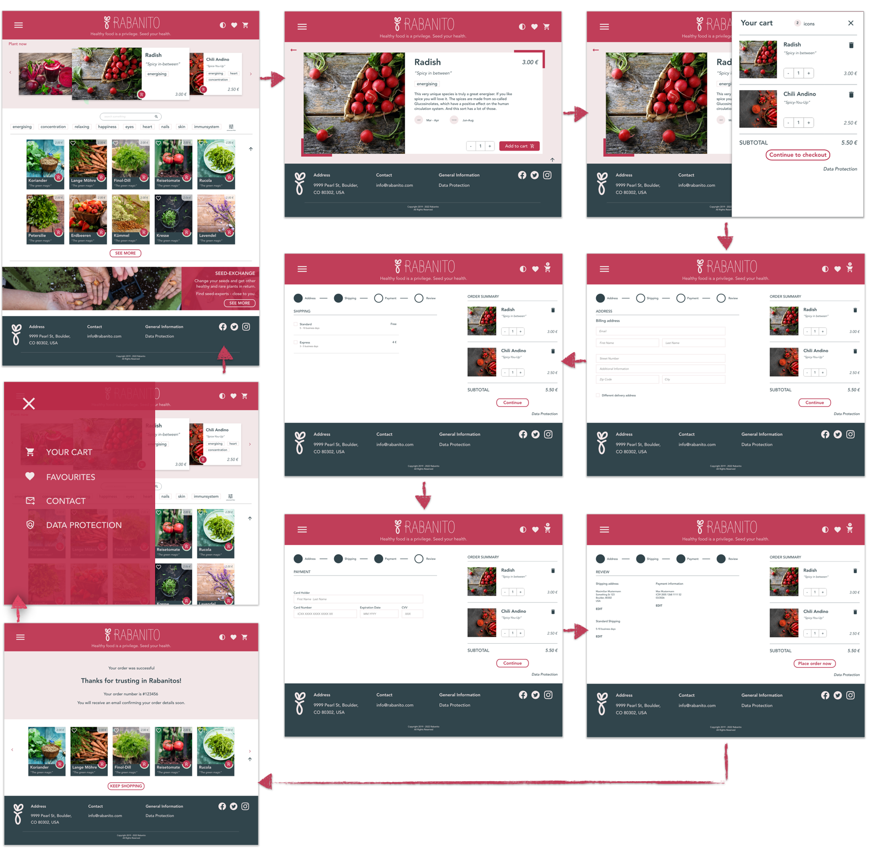
Here I demonstrate my mockups for mobile view showing the purchasing process.
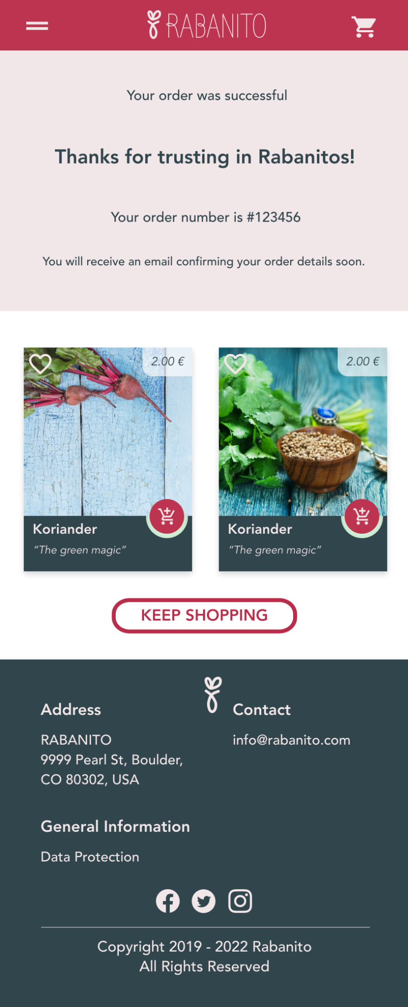
The purchasing process finally leads to a confirmation page with a possibility to reenter the homepage.
A next step within this project would be to also integrate and test the seed exchange page and process.
● ● ●
I learned how to work with Adobe XD and also learned how to integrate small animations - I loved it.
The main learning within this project was how to integrate an intuitive and easy accessible purchasing work flow. Since this is a very complex process, it is useful to split into clear parts.

